FIT Challenges Designers over Shape, Physique, and Fashion’s Future

Red carpet looks for curvy women: Roberto Cavalli’s ensemble, LaQuan Smith’s see-through for Kim Kardashian, and Christian Siriano’s dress for Leslie Jones

Against the historical context provided by examples of how women (and men) have pushed and pulled their bodies into fashionable silhouettes since the 1750s, The Museum at FIT asks a broader, more contemporary question:  Why don’t designers today create attractive clothes for women who don’t fit into a size 2?

The exhibition, The Body: Fashion and Physique, on display through May 5, begins with a thoughtful video in which young New York designers, including Christian Siriano, call for change in the industry to give plus-size women fashion-forward off-the-rack options that project youth, style, and pizzazz.

As usual, FIT has an excellent website for the show, where you can step through 250 years of fashion history in sequence to see and read about how the concept of the “ideal” body has changed.  For some of our favorite items, see our Flickr album.

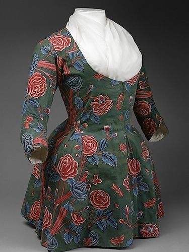
1845-1855 corset with metal eyelets and 1865 Scottish dress buoyed by hooped crinoline

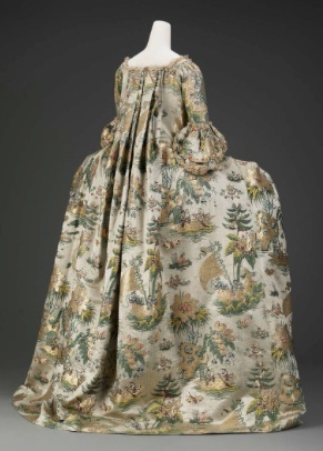
The 1800s fashions on display from the FIT archive pair undergarments – like corsets, crinolines, and bustles – to demonstrate how fashion emphasized the importance of tiny waists through most of the 19th century. The swags covering protruding bustles eventually gave way to the no-corset looks of early 20th century artistic women who worshipped the exotic excesses of Paul Poiret.

The curators focus on the roots of fashion-induced body issues back then, too. An iPad shows the proliferation of fashion illustrations that draw women with impossibly tiny waists. Nearby, they show evidence from their collection to bust the myth that all corsets were laced tight enough to achieve an 18-inch waist. Simply not true. The illusion of that “ideal” was created with wide skirts and pouf sleeves.

When powerful structure was in: a 1981 dress by Mugler and 1986 jacket by Donna Karan

From there, the show moves through the next 100 years, providing examples of tube silhouettes of the Twenties, languid body-skimming styles of the Thirties when women used girdles to achieve the “ideal” body, the built-in structure of Dior’s New Look, and through to more recent times.

Although the intricate architectural cut of a Thierry Mugler dress would not normally be paired with a soft-tailored jacket by Donna Karen, the curators note that the “ideal” shape for women in the 1980s was athletic, fit, and toned. The pairing of these two designers shows how the impact of powerfully shaped fashion worked for equally well for Grace Jones or for powerfully shaped women who inhabited the C-suite.

In more recent times, the show makes the point that designers and image-makers increasingly shifted the “ideal” shape to the super-young and super-slim, encouraging completely unrealistic expectations about women’s bodies. Men and women obsesses over diets and fitness to achieve body shapes that are fairly impossible goals.

Two padded looks: a 1996 statement dress by Rei Kawakubo and the 1994 Wonderbra

The show concludes where it started – with a conversation about how designers, fashion fans, and the rise of social media are influencing and showing how real women dress today.

A fantastic red-carpet evening gown that Siriano designed for Leslie Jones after a Tweet storm ensued about designers not offering to dress a larger woman serves as the cornerstone content of the show. One dress says it all – class, elegance, beauty, sass, and bravery all summed up in one statement-creation.

Listen to what Christian and the other passionate young designers have to say about where fashion must go for the good of all:

If you have more time, listen to the conversation between Valerie Steele and Tim Gunn, which led FIT’s all-day seminar on this topic. This conversation digs deeper into lack of industry and designer support for less-than-ideal-sized women and concludes with ideas on what emerging designers can do to bring about change.

Sixties Bus and Jag Pulling Out of MoMA

1967 bus by Mason Williams and Max Yavno with designer autographs from MoMA’s 1968 Word and Image show, with Joshua Light Snow’s 1967 Liquid Loops

Big alert to baby boomers: Only a little time left to catch MoMA’s big Sixties bus that’s parked on the fourth floor in a room filled with psychedelic posters and a Fillmore-style rock show light extravaganza. It’s all part of the crowd-pleaser of a show that’s been in residence for about a year – From the Collection: 1960-1969, closing March 19.

The curators cleared out the floor and organized their permanent collection year by year, taking you through every movement, ism, and trend in contemporary art of the Sixties, from Rauchenberg’s combines from his downtown loft, to Christo’s wraps, to Warhol’s Pop, the psychedelic revolution in poster and cover art, and the rise of women taking on the art establishment (go, Eva Hesse and Lynda Benglis!). Except for the room with the Beatles and the bus, it’s like vintage Artforum come to life.

Wall of 1967 psychedelic posters publicizing East and West coast rock bands

MoMA called upon six of its departments to assemble the look, touch, and feel of the decade, from scrappy mix-it-up works to minimal plastic design and flat-out revolts to the museum world.

The first room features an sleek Jaguar roadster from the design department, the first commercially produced car to resemble racers. It’s a reminder that aerodynamic lines of 1961 swinging London were a harbringer of things to come as imaginations and images turned to space, rockets, and the future as the years of the Sixties ticked by.

See shots of some of our favorites in a chronological gallery walk in our Flickr album. The decade begins with Bubble wrap (thanks again, design department!) and concludes with NASA Apollo photographs.

The aforementioned bus is actually a flat 1967 display that MoMA kept in its warehouse that was designed by Mason Williams and Max Yavno MoMA’s 1968 poster show Word and Image. It’s covered with autographs of Milton Glaser and other famous designers whose work was featured in the original show.

Jaguar’s aerodynamic 1961 E-Type Roadster sharing space with a Lee Bonticou work

For the rest of the weekend, the bus serves as kind of a boomer hangout. The Avedon Beatles (distributed in magazines worldwide to promote their Sgt. Pepper transition) and other iconic rock images are in the room.

Other hang-outs for different populations include the cushion-cubes near the video monitors showing analog reel-to-reel videos from the years when Portapak video cameras were born (remember when video cameras weren’t on your phone?) an cool art hounds entranced by all four walls of Mr. Rosenquist’s mind-blowing F-111 masterwork. It’s installed just as Mr. Castelli did way back when.

Hear what James Rosenquist was thinking in 1964 as he created his iconic wraparound painting, F-111. Thank you, MoMA!


See Hamilton No Waiting

Taking their Shot in the lobby of the Public Theater in 2015

Taking their Shot in the lobby of the Public Theater in 2015

If you really want to experience Hamilton before the Tony Awards, it’s not that hard. Get up to New-York Historical Society at 77th Street and Central Park West and check out the life-size bronze statues of Hamilton and Burr one second before The Shot.

If you went to see Hamilton last year at the Public, you had to pass right between Kim Crowley’s bronze recreations when you entered the theater — a bespectacled Hamilton (wearing tinted glasses because he was facing the sunrise) and an intense Burr who was branded for all time in the history books one second later.

These action figures were initially installed at NYHS in 2004 as part of its ground-breaking Hamilton show…a magnificent installation that drew both raves (for the classy reimagining of NYHS and its exhibitions program after a near-collapse of that institution) and criticism (was it pandering to New York’s besmirched banking community?).

Their 1797 dueling pistols in the NYHS lobby

Their 1797 dueling pistols in the NYHS lobby

Interesting that 2004 was the 300th anniversary of both the duel and the year that NYHS was founded. In fact, Hamilton’s attending doctor that day was one of the founders.

NYHS Ham

Hamilton takes aim inside NYHS

After three hundred years and countless tries at the Hamilton’s pre-show lottery at the Richard Rodgers Theater, it will be a little disconnect to realize that the two facing off in the white marbled lobby are not Lin Manuel and Leslie Odom, Jr. The intensity and the historical dress are there, but the faces are different. Just stand there and run through all the lyrics you’ve memorized from the show.

Walk a few steps further and gaze down at the actual pistols – not stage props – and Angelica Schuyler’s letter to her brother, conveying the terrible news. All real, in her own hand, dated July 11, 1804.

OK, that’s just the lobby. By now, you’ve probably heard that NYHS has just announced its Summer of Hamilton, replete with a large gallery show of all the Hamilton-related documents, artifacts, and portraits plus special clips from Hamilton, movie musicals that inspired Lin, Ron Chernow’s book, and costumed performers on July 4 weekend.

But why not visit right now and have Ham and Burr all to yourself? To fill in the blanks about Ham’s life or prep to see the Broadway show, treat yourself to an exploration of the 2004 Ham show website. It’s full of all types of fun things – a quiz to test your Ham knowledge, a map of where Hamilton hung out in New York City, and real-life historical portraits of all the Schuyler sisters and everyone else in the Broadway show.

Lin's Ham 4 Ham reading outside the theater during the preview lottery

Lin’s Ham 4 Ham reading outside the theater during the preview lottery

There’s even a handy timeline of Hamilton’s “strange and amazing life,” which is a nice reference for things you’ve seen (or hope to see) in the show. For true fans (or curiosity-seekers), there’s even a small selection of short academic papers on Hamilton, including an interview with Ron Chernow, whose book inspired the current Broadway smash hit, and other brief treatises on his schooling, the duel, and the hours before his death.

Although it’s not inside the museum (or the Richard Rodgers), you can check out other Hamilton excitement at the Ham4Ham shows performed at lottery time on 47th Street, many of which have been taped by fans and put up on YouTube. Check out the recreation of the cabinet meeting by the Tony-nominated crew:

MoMA Salute to Sixties Art World Transmissions

Announcement for Allan Kaprow’s 1968 Three Country Happening with collaborators in Germany and Argentina, one of the earliest artworks to incorporate an international telecast.

Announcement for Allan Kaprow’s 1968 Three Country Happening in NYC, Germany and Argentina, one of the earliest telecast international performance pieces.

Before restaurants and shops populated Tribeca and Soho in the 60s and 70s, edgy New York City artists were experimenting with happenings, video art, performance pieces, mail art, and assorted ephemeral pieces – Cage, Moorman, Kaprow, Ono, Paik, Grooms, Oldenberg and Maciunas to name a few.

In the pre-Internet days they might have been unaware that half a world away, Eastern European and Latin American artists were catching wind of this new art wave and stamping their own brand on their local art scene.

MoMA’s show, Transmissions: Art in Eastern Europe and Latin America, 1960-1980, captures the zeitgeist and shines a light on the artists, movements, and pieces from important avant-garde artists whose names are not as well known in the States. See it through January 3.

Organized into several rooms and themes, it’s a great collaboration among MoMA’s Departments of Media and Performance Art, Photography, and Drawings and Prints. The result puts a lot of MoMA’s huge Fluxus collection into a proper world context.

Socially relevant art posters from Poland, Cuba, Czech Republic, Yugoslavia

Socially relevant art posters from Poland, Cuba, Czech Republic, Yugoslavia

The first half of the show deals with geometry and its spiritual significance, offbeat artist publications, and mash-us between mail art and street performance.

Favorites include post-minimalist pieces from Brazil, Suprematist-style wall works by Yugoslavia’s Mangelos and an entire wall of photos documenting push-the-envelope street art many Eastern European countries. See our Flickr feed for a walk-through and click the links below for glimpses into MoMA’s show blog.

The next section turns more socio-political with works from the Argentine collective, Instituto Torcuasto di Tella – a center of the avant garde in Buenos Aires from 1959 to 1970. The centerpiece is a large installation for the Venice Biennal by David Lameles – Office of Information about the Vietnam War at Three Levels: The Visual Image, Text and Audio. The glass-walled newsroom is a stage from which performers read “breaking news” from the Vietnam War, just as they did when the collective debuted this in 1968. When the performers aren’t present, visitors can listen to archival recordings in three languages to feel transported back in time and reflect on how and if things have changed.

Installation for the 1968 Venice Biennal by Argentina’s David Lameles – Office of Information about the Vietnam War at Three Levels

Installation for the 1968 Venice Biennal by Argentina’s David Lameles – Office of Information about the Vietnam War at Three Levels

Nearby, visitors see clips from Marta Minujin’s Simultaneity in Simultaneity part of Allen Kaprow’s 1968 Three Country Happening, which was one of the first international telecasts of performance art.

Other galleries feature the blossoming of feminist art and performance art, social-commentary painting and sculpture, and poster art on these two continents. Artists that are familiar in US collections — like Botero (Colombia), Marisol (Venezuela), Marina Abramonovic (Serbia), and Ana Mendieta (Cuba) – are displayed in galleries that introduce other stellar artists to entirely new US audiences.

Oscar Bony’s photo documentation of his 1968 performance piece, The Working Class Family, which displayed an actual Argentine family at an exhibition

Oscar Bony’s photo his 1968 performance piece, The Working Class Family, which put an actual Argentine family on display

Consider Oscar Bony’s photo documentation of his controversial 1968 performance piece, The Working Class Family, where an actual Argentine family displayed themselves for the run of an exhibition at Instituto Torcuasto di Tella. Or Romanian graphic designer Geta Bratescu’s Medea IV, a 1980 sewing-machine drawing made and displayed privately in her studio at the height of a repressive political regime when most artists retreated underground.

The show ends with a spectacular installation: Juan Downey’s 1975-76 masterwork, Video Trans Americas. The gallery floor is painted with an outline map of the Western Hemisphere with banks of video monitors placed atop countries to which he traveled from the tip of South America to New York City, showing the life and times of indigenous people.

Chilean artist Juan Downey’s 1975-76 Video Trans Americas, documenting native peoples from his travels from the tip of South America to New York City

Chilean artist Juan Downey’s 1975-76 Video Trans Americas, documenting his travels from the tip of South America to New York City

Inspired by the idea of a transnational identity, Downey’s piece beautifully sums up the feeling of the entire show – artists and people engaged in a cultural dialogue across time and space.

Thankfully MoMA has given these artists a timeless showcase and home.

Fashion Never Sleeps at FIT

Show opens with 2014 synthetic knit and nylon jacket and dress by Istanbul designer Arzu Kaprol “Global Fashion Capitals” Museum at FIT June 2 – November 14, 2015 New York, New York

Ensemble by Istanbul designer Arzu Kaprol

Stepping inside Global Fashion Capitals at the Museum at FIT is an around-the-world trip that gives a nod to fashion’s past while presenting style innovators who are thriving in nearly every corner of the world. Right inside the front door of the exhibit is a powerful mannequin duo straight outta Istanbul. Wow!

Turn around and you’ll see a packed International Fashion Week Calendar and an illuminated world map. It’s pretty clear that every hour or so, the sun rises on another hotbed of sartorial creativity. Except for Antarctica, every continent has multiple fashion weeks, fashion bloggers, innovative designers, and fashion followers all their own. Explore through the show’s website, and visit in person before November 14.

Representing London, Alexander McQueen's 2009 dress and corset

Representing London, Alexander McQueen’s 2009 dress and corset

The curators tell the story of the rise of traditional couture centers — Paris, New York, Milan, and London – through selected looks and accessories, dating all the way back to the mid-19th century and the House of Worth, when the fashion system and seasonal cycles were institutionalized. It’s interesting to learn that by 1949, the House of Dior was generating 5% of French export profits.

Of course, after WWII, New York was hot on the heels of Paris. Eleanor Lambert kickstarted New York’s Fashion Week in 1943 and Halston and his designer pals won their place in the pantheon of style by vanquishing the Parisians in the 1973 Battle of Versailles.

Milan took over the mantle from Rome after World War II, and London came into its own in the Sixties and Seventies with the debut of mad Mod, rocker chic, and Westwood’s over-the-top subversions.

Alexander Wang's 2015 dress from Nike's “flyknit” sneaker fabric

Alexander Wang’s 2015 dress from Nike’s “flyknit” sneaker fabric

In each section, the curators are careful to add a look from recent runways – Christopher Kane’s layered silk organza masterpiece and Alexander Wang’s shift made from the same fabric as Nike’s “flyknit” sneakers.

But the remainder of the floor space tells the story of other influential capitals of fashion – the 1981 emergence of the Antwerp 6 in Belgium; Tokyo’s wild ride with Miyake, Yamamoto, and Kawakubo; and what H&M did for Scandinavia as a fashion capital.

Next, the show highlights cities and fashion culture in Kiev, Mexico City, Sao Paulo, Lagos, J-burg, Sydney, Seoul and Mumbai. Click through these fashion histories on the FIT exhibition site, and marvel at Lisa Folawiyo’s bead-encrusted dress (Lagos) and Lie Sangbong’s graphic silk ensemble (Seoul).

Take a trip through the gallery on our Flickr site, and watch an interview with curator Ariele Elia below:

And for more on the Battle of Versailles, courtesy of FIT, click here.

10 Things to Know About Pluto’s Star Turn This Week

In real time, AMNH astrovisualization guru Carter Emmart notes the moment that humans reached the furthest point of exploration on Pluto on the big screen

In real time, AMNH astrovisualization guru Carter Emmart notes the moment that humans reached the furthest point of exploration, passing beyond Pluto

The American Museum of Natural History hosted a sold-out event at the crack of dawn this week to give Pluto fans (and Dr. Neil) a real time, play-by-play of what was happening on the edge of our solar system.

Check out our Flickr feed to see the visualizations created by Dr. Carter Emmart’s team at the Hayden Planetarium and glimpse some of the (human) stars at Mission Control and others who weighed in via Google Hangout from planetariums from around the world.

Here are 10 essential things you should know:

Pluto’s photo from earlier in the week appears on the Google Hangout, showing the “heart” area

Pluto’s photo from earlier in the week appears on the Google Hangout, showing the “heart” area

1) It was a fly-by. The New Horizons spacecraft flew by Pluto. It didn’t land or orbit around it.

2) Pluto has a reddish tint. The new color photos show that Mars isn’t alone.

3) Pluto has five moons. New Horizons is looking for more.

4) This marks the furthest point of human exploration to date. It happened just before 9 a.m. on Tuesday, July 14.

Just in -- the latest from New Horizons: July 17 photo of smooth frozen plains in Pluto’s “heart”

Just in — the latest from New Horizons: July 17 photo of smooth frozen plains in Pluto’s “heart”

5) The spacecraft, New Horizons, is the size of a grand piano. It traveled over 3 billion miles.

6) It took New Horizons 9-1/2 years to get to Pluto. It was launched January 17, 2006 and is expected to keep going out into space for another ten years. For the full story, click here.

7) The new photos confirm that Pluto is young and doesn’t have any craters (like our Moon or Neptune). Its 11,000-foot ice mountains are only 100 million years old (compared to the Rockies at 80 million years old). They formed during our Cretaceous period. More discoveries to come photos and data slowly stream in.

Fran Bagenal, New Horizons's co-PI, and Alice Bowman, the Mission Operation Manager — the first female Mission Operation Manager at APL Johns Hopkins

Fran Bagenal, New Horizons’s co-PI, and Alice Bowman, the first female Mission Operation Manager at APL

8) The transmission speed from the spacecraft is half the speed of an old dial-up modem. That’s why mission control will be receiving photos and other data from this fly-by for the next sixteen months or more.

9) Twenty-five percent of the people on the New Horizons project are women. Alice Bowman is the first female Mission Operations Manager at APL Johns Hopkins.

10) Dr. Neil keeps correcting people to call Pluto a “dwarf planet” but all of the scientists interviewed on the mission love it anyway. Some fans think it should be “grandfathered” into the solar system as an honorary planet.

Neil de Grasse Tyson reminds astrobiologist David Grinspoon at Mission Control to call Pluto a “dwarf” planet

Neil de Grasse Tyson reminds astrobiologist David Grinspoon at Mission Control to call Pluto a “dwarf” planet

Does Pluto have a molten core? What’s the topography of Charon? Are there geysers? Are there other moons? What’s going on with the Kuiper Belt? Stay tuned as New Horizons keeps going.

NASA has a TV channel featuring (now) daily media briefings on the photos and data and has a channel with all the updates on New Horizons, including links to new photos.

Also, tune into the New Horizons site hosted by mission control at APL Johns Hopkins. Next month, releases will be on a monthly basis.

Real-time visualization of how the New Horizons maps Pluto

Real-time visualization of how the New Horizons maps Pluto

Credit goes to Carter Emmart, AMNH’s director of astrovisualization, and the other creators of the Digital Universe for inventing this 4D open-source software and sharing it with planetariums around the world and applause for the scientists that made this expedition happen!

Nearly 11,000 people watched this live telecast from AMNH. If you have time, enjoy it for yourself by watching this YouTube recording of the event, currently at 46K views and counting:


World Wide Web (and Weft) of Past Centuries at The Met

1730s Dutch brocaded satin, featuring exotic Asian islands and fauna, was refashioned into a more fashionable French frock in 1770. Source: Museum of Fine Arts, Boston. The Elizabeth Day McCormick Collection

1730s Dutch brocaded satin showing exotic Asian islands and fauna was refashioned in 1770 into a more fashionable French look. Source: Museum of Fine Arts, Boston.

A joyous collaboration among eight departments of the Metropolitan Museum of Art has written a new history of how a global network of fabric trade and manufacture once served the same purpose that YouTube, music videos, shelter magazines, Vogue, and The New York Times Style section do today – to present images of the latest trends and make anyone in the world that sees them understand the clothes or accessories needed to be “on trend” with other sophisticates.

Interwoven Globe: The Worldwide Textile Trade, 1500–1800, running through January 5, tells a monumental story about how trends went viral pre-Internet. It was a slower world dominated by sailing ships versus transoceanic cables, but the tale spanning centuries, continents, and cultures shows how gorgeous garments, incredible tapestries, bedazzled church vestments, quilted bedding, luxurious wall hangings, tour-de-force printed fabrics, and royal furniture telegraphed “trend” in a different way.

Embroidered muslin dress and fichu. The 18th c. craze for Neoclassical across Europe drove massive imports of lighter-than-air Bengali muslin. Source: The Met

Embroidered muslin dress. The 18th c. European Neoclassical craze drove massive imports of airy Bengali muslin. Source: The Met

The show can’t fully be appreciated in just one walk-through. Each textile and garment is incredible to behold, and the network of interrelationships among craftsmen, artisans, tradesmen, royal buyers, rich merchants, and brave sailors traversing strange shores is equally rich, complex, and layered.

This two-dimensional pageant, enhanced by exquisite gowns and garments whose fabrics were sourced from the four corners of the globe, is given the full-bore treatment in the top-floor galleries reserved for blockbusters.

How do you tell a story this big? The curators decided to put a large interactive map of the 16th- to 18th-century trade routes right inside the door, which brings you up to speed on the French, Portuguese, Spanish, Dutch, and British trade routes linking the Americas, India, the Orient, and islands.

Then come the galleries dedicated to the styles and fiber-tech associated with each – silks woven in China for Europe and Japan, Spanish embroideries that reference Islamic carpet borders, weavings made by Peruvian grand masters of the art, and Indian resist-dye masterpieces that turned into English chintz and fabrics for the King of Siam.

Japanese Jinbaori made from Dutch 17th century wool and Chinese silk, a luxury item worn over samurai armor. Source: John C. Weber Collection

17th c. Japanese Jinbaori made from Dutch wool and Chinese silk, a luxury item worn over samurai armor. Source: John C. Weber Collection

In the Spanish gallery, you’ll see how the crowned double-headed eagles of the Hapsburgs adopt kind of a Chinese-phoenix look when 16th-century Iberian traders commissioned silk artists in Macau to create silk they could sell back home. By the 17th century, everyone – East and West – had become accustomed to enjoying “exotic” images from halfway around the world – birds, animals, architecture, flowers, and landscapes. It had the same impact as Google Earth and World Wide Web access today.

One of the more startling facts is that before Commodore Perry “opened” Japan to the West (ref. Sondheim’s Pacific Overtures, the musical), Japan was more into luxury-goods consumption than production. Apparently, the trend was to import the ultra-luxury, Dutch wool, and make it into topcoats that Samurai warriors could drape over their armor.

If you don’t see this in person, visit the online exhibition site for an encounter that’s a real treat: You’ll get to zoom into each quilt, drape, embroidery, dress, shawl, and piece of fabric to see it all super-close.

A late-18th century Indian-chintz Dutch jacket that knocked-off a French designer jacket in pink French fabric. Both have similar exotic floral prints. Source: The Met

A late-18th century Indian-chintz Dutch jacket that knocked-off a French designer jacket in pink French fabric. Both have similar exotic floral prints. Source: The Met

Click on the “full screen” button on each and toggle in to examine all of the glorious detail. The web site will tell you the story and show you the items in each gallery. You’ll be surprised to find the genesis of the fabrics-on-walls interior-decorating craze for country homes in the late 1700s and how men-only clubs adopted both plain and exotic dressing-gown dress from the Orient (a style also featured prominently in the current FIT show).

The King of Siam’s royal 18th century guard wore these resist-dye tunics. Fabrics were made in India and tailored in Siam. Source: Royal Ontario Museum, Toronto

The King of Siam’s royal 18th century guard wore these resist-dye tunics. Fabrics were made in India and tailored in Siam. Source: Royal Ontario Museum, Toronto

FIT’s Fresh Take on History via Monocles, Wigs, and Gowns

1924 short-hair, no-hips “boy” look with the signifying monocle.

1924 short-hair, no-hips “boy” look with the signifying monocle.

FIT’s powerful exhibition, A Queer History of Fashion: From the Closet to the Catwalk, throws open the window on what the curators felt was an untold story, and they’ve done history proud — creating a show and website featuring key clothing, points of view, and socio-political breakthroughs during more than 250 years of LGBT history. Visit before January 4.

If you think you know everything about fashion, peruse FIT’s downstairs gallery (or the website) and see how quickly you learn a new angle, a clue, or an insight from the context in which the curators tell their story – a style, epaulet, pattern, tie, mod look, or detail that conveys entirely new meaning.

Right at the foot of the stairs, you’re confronted with side-by-side late 19th century and early 20th sartorial clues sported by the era’s elegant lesbians and gay dandies – shirt collars and ties and Mr. Wilde’s telltale green carnation.

The suit that Andy had made in Hong Kong in 1956 on his first trip abroad compared to his super-hip King of Pop 1960s uniform.

The suit that Andy had made in Hong Kong in 1956 on his first trip abroad compared to his super-hip King of Pop 1960s uniform.

Entering the main gallery, you’ll meet monocled ladies of 1920s Montmartre posing in the “boy look” that went viral throughout the Twenties. Yes, the short hair and mode de le garçonne was adopted by every flapper in the world, but the curators link these changes to trends first sported in scandalous Parisian same-sex clubs.

The clothes tell story after story of how iconic fashion trends were first incubated within gay subcultures – Gernreich’s unisex caftans in the 1960s, YSL channeling Marlene’s tuxes into his 70s “Le Smoking” looks, leather trends in the 80s, and Versace’s bondage dresses in the 90s.

The mannequins have often been touched up with accessories and wigs to evoke innovators and eras, such as the two wigged Warhols, including his striped T and skinny jeans look that seems so “now”.

Other clothes suggest additional narratives: slinky glamour gowns channeling a gay designer’s obsession with feminine ideals, camp queen adaptation of exaggerated feminine points of glory, pre- and post-Stonewall sartorial identity, and even what people are wearing today for their same-sex wedding ceremonies.

Naomi flaunting Gianni’s 1992 bondage-inspired leather couture.

Naomi flaunting Gianni’s 1992 bondage-inspired leather couture.

So many stories, so little time. The security guards literally had to turn the lights off last Saturday night (when FIT closes at 5pm) because the throngs of captivated museum-goers simply didn’t want to leave with so much yet to absorb – Dietrich’s cross-dressing wardrobe on loan from Berlin’s film museum, a Charles James gown from Doris Duke, a Halston provided by Lauren Bacall, the iconic CK underwear billboard image from Times Square, Larry Kramer’s YSL Rive Gauche suit from the 70s, a Mugler-designed gown for chanteuse Joey Arias, and Ru Paul’s red vinyl…well, outfit.

And we haven’t even touched upon the Versace section filled with his Warhol patterns, studded leather, and Baroque-print fantasies. One fan confided that it was her second time because the visuals, details, and narratives were so much to take in.

If you can’t get there before January 4, check out the clothing, concepts, oral histories, and historic timeline on line and yak about it on Facebook.

From Mr. McQueen’s Plato’s Atlantis collection, 2010.

From Mr. McQueen’s Plato’s Atlantis collection, 2010.

Hear what inspired curators Valerie Steele and Fred Dennis in this 6-minute Culture Beat episode, and go to FIT’s YouTube site to hear what 20 designers, celebs, and academics had to say at FIT’s symposium on the queer history of fashion.

Here’s Simon Doonan of Barney’s (think windows) talking about how gay style had an impact on the 1960s look on Carnaby Street (so, that’s where those flowered shirts came from!), why overt visual influences are not so evident today, and why the next generation needs to learn about the “fallen heroes” of the late 20th century design community.

Founders in Beta

Founders OnlineThere’s no better way to celebrate the Fourth of July weekend than spending a little time with Founders Online, a collaboration between the National Archives and the University of Virginia Press, featuring posts from six of our most popular founding fathers – Washington, Franklin, Hamilton, Adams, Jefferson, and Madison.

The National Historical Publication and Records Commission (within the Archives) decided to liberate everyone from trekking to libraries by putting all of the diary posts, letters, and day-to-day chronicles of the Founders online.

You can go right to the earliest drafts of Tom J’s Declaration, and read young Washington’s journal entries on his first trip over the mountains of western Virgina in 1747.

The site, still in beta, currently has over 119,000 searchable documents – who wrote to whom and what the daily buzz was about in the colonial times. You can search by person, sender, recipient, concept, or era.

Jump in and see what Franklin’s or Hamilton’s revolutionary days were like, or ramble through the early White House years. It will be like scanning 18th century Twitter feeds or FB timelines of your favorite founders.

(And speaking of beta, check out Tom J’s copy of his unedited Declaration in the new NYPL Digital Collection.)

Washington, D.C. Museum Videos Reach 14 Million YouTube Views

Since Smithsonian branches and other Washington, D.C. museums, zoos, and gardens began posting videos on line in 2007, collective YouTube views have climbed to 14 million, as chronicled in our latest report, Washington D.C. Museums: 2013 Video and Social Media Rankings.

Although the 14 million total is less than the 49 million views racked up by New York museums, don’t forget that two high-profile DC institutions – National Geographic and the Smithsonian – produce significant amounts of programming distributed on their popular cable TV channels, dedicated apps, and snazzy web sites. Even though it has a DC museum space, NatGeo (a joint venture with Fox Cable) has largely abandoned YouTube; however, the 18 individual Smithsonian branches are all still posting their own stuff regardless of the more comprehensive joint venture with Showtime.

In the Top 2012 Cultural Museum Video, archival footage is cleverly coupled with behind-the-scenes looks at the National Archives’ 1940s Census release

In the Top Cultural Museum Video, archival footage is cleverly coupled with behind-the-scenes looks at the National Archives’ 1940s Census release

Here are some findings from our report on video and social media produced by DC institutions:

As of year-end 2012, the Washington museums having the highest number of total YouTube channel views were the Library of Congress (4.5M), the National Archives (2.1M), and the United States Holocaust Memorial Museum (1.6M). The top two are information powerhouses with massive collections to push out for public consumption, and the third is right on their heels with an innovative series with curators interpreting interesting items from their collections.

All-time top DC museum video, one of Edison’s earliest films, with over 329K hits on YouTube

All-time top DC museum video, one of Edison’s earliest films, with over 329K hits on YouTube

Edison still delivers. It’s interesting that the top ranked DC museum video of all time is Edison Kinetoscopic Record of a Sneeze, Jan. 7, 1894, the earliest surviving copyrighted moviesuggesting that our greatest media innovator is having the last laugh, contributing over 329,000 hits to the number-one ranking by Library of Congress on YouTube. It’s short enough for Fred Ott to be on Vine.

Four museum video channels have surpassed 1 million views. To put the DC numbers in context, if they were merged with the New York museum video rankings, the Library of Congress (4.5M) would rank seventh, just ahead of the Metropolitan Museum of Art. The Library of Congress would rank eight (2.1M), just ahead of the New York Public Library.

The National Zoo produced Washington’s top-viewed 2012 museum video – Shanthi, the National Zoo’s Musical Elephant, Plays the Harmonica!. Over 290,000 viewers watched this middle-aged mom experiment with a musical instrument in her enclosure and listen to her keeper talk about her performance. Shanthi’s viewership greatly surpassed the numbers generated by the most popular 2011 Washington museum video, the National Portrait Gallery’s Conan O’ Brien as Seen by Artist John Kascht. Surely, Conan would be amused.

The Smithsonian American Art Museum’s Top Exhibition Video of 2012 features curator Chris Melisinos describing why video games belong in an art museum

The Smithsonian American Art Museum’s Top Exhibition Video of 2012 features curator Chris Melisinos describing why video games belong in an art museum

The top cultural video was a behind-the-scenes work at the National Archives for the release of the 1940s census. Over 115,000 family historians watched Learn About the 1940s Census, which showed the Archives census team, provided information on how to find your family’s records, and worked in interesting archival footage from the original census.

The Smithsonian American Art Museum produced Washington’s top video about a museum exhibition. Over 28,600 people watched The Art of Video Games: Chris Melissinos, Curator, a brief look into the evolution of the stories, technology, and visualization advances of this mass entertainment medium.

A few of the Flickr sets from Library of Congress

A few of the Flickr sets from Library of Congress

The most active Twitter users are the National Museum of American History, the National Air and Space Museum, and the National Postal Museum. But except for Air and Space, it’s a different set for Facebook followers.

The most active Flickr users are the National Archives, the Library of Congress, and the Smithsonian American Art Museum. The Archives has organized its photos into creatively themed sets, such as “White House Wednesdays,” “Millinery Monday,” pictures of the 1940s census being taken, and pets of the First Families. The Library of Congress also posts a folder containing “mystery” photos and asks the public to help to identify them.

All the detailed video and social media statistics on 42 museums are in the report. Click here to see what’s included and make a purchase from our Its News To You Reports shop.

Enjoy the most popular DC museum video, a musical visit with the National Zoo’s sensation, Shanthi: