Crowds surround Kara Walker’s monumental sugar sculpture
The crowds lined up yesterday on Kent Avenue all the way beyond the Williamsburg Bridge, almost to Schaeffer’s Landing, waiting to enter the rusted, aromatic, tumble-down confines of the old Domino Sugar Factory on one of the last days to see Kara Walker’s “A Subtlety, or The Marvelous Sugar Baby”, commissioned by Creative Time.
Today is the last day, so take a look at history in person, on our Flickr page, or in the video below.
Security was in full force to keep the Williamsburg bike path clear and drivers were slowing down to ask, “What’s going on and what are people waiting for?” only to be told by patient fans, “They’re lined up to see art!”
Once inside, the marvelous, gigantic Sugar Baby sculpture was on hand to preside over the far end of the abandoned several-block-long 1851 industrial space that once refined over half the sugar consumed in the entire United States.
One of her many attendants throughout the factory
As readers of Friday’s front-page article in The New York Times knew, Walker was again pushing the buttons with her homage to the brutal history of the sugar trade from the 1700s until today by giving us an experience that isn’t really all that sweet. Witnessing Kara’s witnessing is what had people – including some elderly visitors on canes — flocking to the sticky-floored, slightly ominous space. You could smell the sugar and molasses before you even entered the door.
Leading up to the gigantic white sculpture, people encountered all sorts of molasses-children, toting baskets full of…well…looks/smells like molasses. The experience evokes everything that Kara wished for…history, economics, society, race, abuse, industrial profit, and industrial scale.
Take a look at how it was made, and read about the history behind her thinking. Click on this link to Vimeo, look on the Creative Time website to see her sketches and graphic inspirations, and be sure to check out the various stages of Kara’s 3D digital sphinx up close.
If you go to Brooklyn today, expect to wait about an hour in line; once inside, there’s plenty to think about.
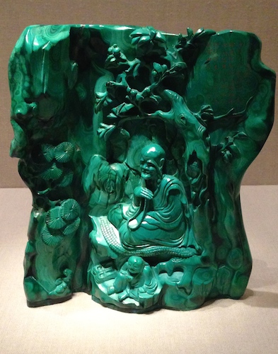
Converse had to have this tiny green malachite sculpture of a teacher seated in a grotto.
The tiny show in the upper gallery at the far, far end of the Metropolitan Museum’s Asian Wing shows just how far two industrialists would go to collect eye-popping dazzlers from 18th and 19th century China. Colors of the Universe: Chinese Hardstone Carvingsruns through October 9, 2017.
The curators want you to now that intricately carved and polished stones from China’s Qing Dynasty go way beyond green and white jade to the blacks, tans, reds, oranges, roses, and blues of a wide variety of stones available to the Chinese 18th and 19th century artisans — malachite, chalcedony, amethyst, coral, lapis, and carnelian. See them all lovingly displayed in Gallery 222.
Look at our Flickr page, and check out other images in the Met’s photo gallery. If you can get to the Met, walk all the way to the end of the Asian wing on the Second Floor and take the stairs or elevator up. When we visited, there were no shortage of Asian tour groups filing through and snapping photos.
Who wouldn’t want to have a miniature Peanuts and Jujube Dates carved from chalcedony? Heber Bishop bought this. It’s just over one inch high. 18th c. China
The ancient art of Chinese stone carving reached its zenith during the Qing (1644-1911), known in movies and pop culture as the Manchu Dynasty. It was a time when emperors painted and wrote poems, the Peking opera was born, and culinary culture (tea ceremonies and gourmet dishes) rivaled today’s elevation of foodie culture. Scholars and the highly educated upper classes went to town outdoing one another with ink, paper, and acquisitions.
Qing craftsmen enjoyed lots of royal patronage, and any materials required to produce something fantastic – including colorful stones — were available. Although this show includes personal jewelry and a few carved pots and brushes used by high-end scholars, the focus is really on the “look at this” display pieces.
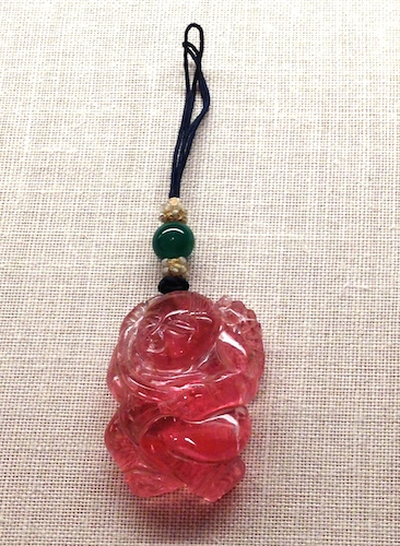
Tiny pendant in the Shape of a Boy, carved and polished tourmaline
These fantastic pieces were mostly acquired by two powerful industrialists of 19th century and early 20th century New York. Colorful miniature landscapes, lions, kids, fruits, vegetables, and seafood were irresistible.
Several stunning pieces were bequeathed by Edmund Converse, an industrialist-collector who otherwise focused on big jade and European oil paintings. But even when his stuff went to the Met in 1921, the curators noted that the quality and delight of his assemblage of little colorful non-jade Chinese hardstones.
But most of what you’ll see in Gallery 222 was collected and given to the Met by Heber Bishop, an industrialist who began in the Cuban sugar business in the 1860s, but later went on to many other industries (gas, iron, and railways) and was one of the backer-builders of New York’s Third Avenue El.
Bishop could not resist a tiny polished lapis lion with a little cub peeking out. It’s just over 2 inches high.
Like many cultured gentlemen of his time, his passion for anthropology and collecting found its end-point in many NYC institutions. He went everywhere and bought everything, including vast amounts of Asian textiles, lacquers, bronzes, swords, and ironwork, but he was crazy for jade. Eventually his collection surpassed any of the jade collections of European museums, and he decided to make a big donation to the Met.
Although there doesn’t seem to be any sign of it now, he made the donation on one condition – that the magnificent pieces be housed in a room that was an exact reproduction of his ballroom at home where it had been so lovingly housed.
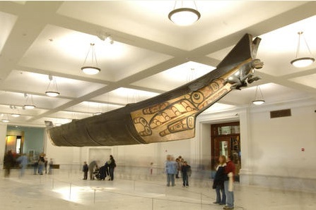
Who knows what became of that idea 100 years later, but we know that one of Bishop’s biggest buys did get it’s own room across town: Any day of the week at the American Museum of Natural History you can admire the spectacular 64-foot Haida canoe transported from Bella Bella, suspended in the recently spiffed-up Grand Gallery on AMNH’s First Floor. Although it’s wood, it’s carved from a single piece, just like his little Chinese stones.
You can almost hear the rustling pandan leaves, waterfalls rushing into exotic coves, and the drums and chants of fiery Tahitian rituals around powerful idols long since banned by the Christian missionaries…but only if you take the time to get close to the smaller works in MoMA’s revealing sixth-floor show, Gauguin: Metamorphosesthrough June 8.
Yes, Gauguin’s bright, colorful paintings of island life are displayed, but the show is really about the darker, more primitive experience expressed in Mr. Gauguin’s ceramics, woodcuts, carvings, and monoprints – the works that we rarely get to see en masse.
After nearly two decades plugging away at his day job, weathering a stock-market crash, struggling to stay in the middle class, cranking out artworks in his spare time, and showing with the Impressionists, he just chucked it all, packed a bag, and went to Tahiti in 1891. From his young-adult years working in the merchant marine, he figured Tahiti was as far away as he could get from his family, responsibilities, and the frustrating Paris art scene where others were making it besides him.
Nothing’s perfect, and the Tahiti he arrived in was already changing from contact with the global trade networks of industrialized countries. No matter. Gauguin was captivated by the thought of connecting with the “true” primitive and savage that lived in the myths, lore, and natural beauty of Polynesia and shoving it all into the face of the avant-garde and art-buying public back home.
The curators have assembled all the images Gauguin created for three dramatic series of woodcuts. The rough edges really come out in Noa Noa (1893) and The Vollard Suite, with a few of the gouged-out woodblocks exhibited right next to several states of the same image.
Black, dark, primitive, edgy – too edgy, in fact, for his dealer, Mr. Vollard, who felt that the prettier oil paintings were a lot more palatable to his clients. (Vollard kept the more expressive primitive prints in the drawer.)
Take a look on MoMA’s special website for the show, which has a detailed timeline for Gauguin’s travels. Clicking on images on the site allows you to zoom in closely on each work. A particularly nice touch is the full digitized version of Gauguin’s unpublished Noa Noa manuscript, which he assembled (but never published) to interpret all the exotic images and symbols of the series for the public and his hoped-for fans. Scroll down to the bottom of this page to see the manuscript, page by page.
So here’s your chance to examine what was boxed up for so long along alongside magnificently disturbing sculptures, panels, and reliefs of goddesses, devils, spirits, waves, women, and mountains created out of tamanu and pua wood with the occasional daubs of colored paint. It’s clear that the design and detail of Gauguin’s beautiful symbolist color paintings got a further workout through all of these other works portraying the dark, mysterious side of life forces emanating from the mind of a struggling artist obsessed with the uber-primitive.
Some say that Picasso was inspired to transform his Demoiselles after seeing some of this raw work (exhibited after Gauguin’s death). Say hello to them seven days a week on MoMA’s 5th Floor.
Detail of Elijah Burgher’s The Pattern of All Patience 1 (2014), featuring magical symbols, installed on the second floor
It’s the last time the Whitney Biennial is holding its big, expansive, colorful, and provocative shindig on the Upper East Side, since it will decamp to its new riverside home at the foot of the High Line next year. Go before it ends on May 25.
It’s amazing to think that this is the 77th time that the Whitney has hosted either an annual or biennial show to showcase the best of American art, as controversial and impossible a task as that may be. This year, the Whitney threw in the towel in trying to showcase “the best” of what’s going on in contemporary art coast to coast. It just wasn’t possible given the expanse, diversity, and barrier-breaking works that American artists are cranking out right now.
Instead, the Whitney invited three innovative curators to choose what should be shown on each of three floors and around town. (Yes, there are offsite works, too.)
Pillar of Inquiry/Supple Column (2013-2014) by fiber artist superstar Sheila Hicks
The divide-and-conquer approach works, resulting in a fun variety of media, installations, paintings, sculptures, textile art, performance, and collections-as-art. The team pulled it all together in only 18 months while still doing their day jobs at Chicago’s Art Institute, London’s Tate Modern, and Philadelphia’s ICA.
Visit our Flickr album and walk through the press preview with us, where several artists were on hand in the galleries with their work.
It’s a happier, lighter show compared to past Biennials, but that doesn’t mean that the artists ignore social commentary or darker sides of human nature. It just means that you won’t feel as though you need a graduate degree in Conceptual Art to enjoy and ponder the work you’ll encounter.
Highlights: Charlemagne Palestine has created a surprisingly spooky installation in the stairwell that features sonorous sounds emanating from speakers adorned with stuffed animals. LA painter Rebecca Morris has two bright, gigantic delightful paintings on the second floor, curated by Philadelphia’s Anthony Elms, which features several satisfying collections-as-art installations by Julie Ault, Richard Hawkins, and Catherine Opie.
Pterosaur and giant theropod are featured in Shio Kusaka’s fourth-floor ceramics display
Fans of NYC’s 1970s art scene (when Soho was still industrial) will be captivated by The Gregory Battcock Archive, peering at the ephemera collected by one of the decade’s most prominent art critics who died under mysterious circumstances in 1980. Amazingly, it was all found by artist Joseph Grigley wafting around garbage bins in an abandoned storage facility. Grigley’s created a disciplined, loving, and intimate installation of reclaimed Battcock mementos, memories, and letters with Cage, Warhol, Moorman, Paik, Ono, and other 70s superstars.
The top floor takes a down-home approach to some very enjoyable paintings, sculptures, installations, and ceramics. Midwest curator Michelle Grabner said that she wishes she could just camp out there for the run of the show. You’ll enjoy it, too — a dreamy installation by Joel Otterson, a monumental yarn pillar by uber-fiber-artist Sheila Hicks, a witty desk and bookcase by master woodsman-sculptor David Robbins, and shelf of delicate and whimsical ceramics by Shio Kusaka.
Knits with commentary by Lisa Anne Auerbach, including WeAreAllPussyRiot
The third floor, curated by Stuart Comer (who’s recently moved to MoMA), features a lot of screens and digital media, essentially making you think about art in the age of the iPhone. As you step out of the elevator, you’ll encounter Ken Okiishi’s series of painted panels. Oh, wait! They’re actually abstract paintings on upended flat-screen TV displays – sort of like what would happen if Kandinsky’s Seasons were done at the Samsung plant.
The mixing of media keeps morphing in room after room of clever installations by Triple Canopy (antiques meet 3D printing) and Lisa Anne Auerbach (knitting meets social commentary, and zines meet the Giant in Jack and the Beanstalk). See Lisa’s work and listen to her explain her knitting:
There are dozens of other videos and audio guide stops posted on the Biennial web site (click on “watch and listen”), as well as bios of all the artists.
Yang Jiechang’s Crying Landscape (2003) shares the Gallery for Art of Ancient China with a sandstone stele from the Northern Wei dynasty (489-495) and the 1319 Buddha of Medicine.
Normally, the galleries for Asian Art at the Metropolitan Museum of Art are pretty tranquil. But through April 6, you’ll find them buzzing with contemporary art lovers reveling in the hunt to find the most famous, subversive, subtle works by Chinese painters, sculptors, and digital artists residing amidst centuries-old treasures in the widely popular exhibition, Ink Art: Past as Present in Contemporary China.
The Met gave the Chinese art curators free reign to pluck sly works from the in-house contemporary collections created by Chinese artists over the last 20 years, grab monumental works from private collectors, and mount a tribute to how post-Cultural Revolution innovators parse the traditions associated with centuries-old art making in their ancestral country.
How do the hottest artists on the planet turn calligraphy and inked woodblocks into biting social commentary? Take a stroll through the second floor Asian art wing.
Inspired by Cultural Revolution posters, the letters in Wu Shanzhuan’s Character Image of Black Character Font (1989) have no meaning. Courtesy: Private collector, the artist.
Just past the balcony-bar area, the monumental 1319 Buddha of Medicine mural from Shanxi Province, China, casts a benign presence over the Gallery for Art of Ancient China. But just stage right, two larger-than-life works on paper preview how Chinese artists twist the “then” into the “now”.
Yang Jiechang’s Crying Landscape panels are painted in the beautiful, colorful “old school” flat Asian style but depict decidedly unbeautiful industrial and political subjects. Similarly, Qiu Zhirie’s Nanjing Yangzi River Bridge ink triptych features masterful, large-scale ink-brush technique but uses art-world icons to relay a disturbing story. It’s an installation triumph that will haunt you every time you pass through that room again.
Large-scale calligraphy by many of the artists makes ink-pot-and-brush tradition echo with gestures as large as Rothko’s. In the galleries with meticulously crafted “landscape” drawings and images, you’ll ask how this modern crew managed to produce scrolls with such heft and detail. Take a walk-through of the show through our Flickr site.
In 1995, Ai Weiwei corporatized a Han Dynasty (206 B.C. – 9 A.D.) earthenware jar. Courtesy: M + Sigg, the artist
Along the way to back of the wing, the curators play hide-and-seek, putting Ai Weiwei’s “enhanced” Han Dynasty jar right in the aisle with the “unmodernized” earthenware vessels, and mounting Hong Hoo’s subtly colored, hilarious historical “atlas” silkscreens in a case that practically dares unfocused visitors to pass them by as they drift toward the Astor Court.
Hopefully by the time they get to the rock garden they will notice Zhang Jianjun’s crazy pink silicone rubber “scholar rock” right next to the real ones. Zhan Wang’s stainless steel scholar rock and Shou Fan’s side chairs are beautifully arranged in the Ming Dynasty room just off the Court, along with more of Ai Weiwei’s furniture hijinx.
After you’re done getting a feel for how the galleries have been transformed, go back into the Met’s exhibition web site to study the brushwork and details and get to know some of the artists.
Zhang Jianjun’s 2008 silicone rubber ScholarRock (TheMirageGarden) sits under a 17th-century pagoda in the Met’s Astor Court. Courtesy: Sigg Collection, the atist
Although the web site appears to be more plain-vanilla than jazzy, you’ll be surprised to see that the digital back-end of the Met archives lets you zoom into each of the paintings to see the handsome handwork of each of these wunderkinds from each thematic section of the show. You can even peruse the gigantic scrolls up close, section by section.
The video room, where art lovers can relax and watch a rotating collection of work, is a nice touch. The modern digital sign to the side tells you exactly where you are in the rotation.
Here’s a link to one of the featured videos: Get to know the constantly transforming cityscape of Beijing through Chen Shaoxiong’s 2005 Ink City, and see what happens when a contemporary artist paints daily life in Beijing with traditional tools and ports his day-to-night experience to video.
For four action-packed days, the art crowd made its way to the West Coast of Manhattan Island past gritty lots, warehouses, the ball fields of Clinton, and high-rises-under-construction to enter a white, light-filled glittery expanse of painting, sculpture, and champagne bars at the 2014 edition of The Armory Show.
This year, 205 exhibitors showed off the best in modern masters and contemporary upstarts. Walk through it with us on our Flickr feed.
If you’ve never been there, just know that the art fills two full piers (yes, where the cruise ships come in). You may think the Whitney Biennial is big, but The Armory promenade is vast.
On the Modern Pier: Chicago’s Alan Koppel Gallery gave tribute to original Armory Show in 1913 with several Duchamps, but most of the work is post-1940 by Modern superstars. Right at the start of the pier, Galleria d’Arte Maggiori positioned a nice rough-and-ready Mattia Moreni in kind-of a face-off with a pretty primitive Basquiat nearby.
Dramatic paper collage and charcoal work by Elaine de Kooning with two little Picasso ceramics at Vivian Horan
Best on the Modern Pier: Vivian Horan’s booth, dominated by a large Elaine de Kooning charcoal drawing with collage, but populated by two small Picasso ceramics that most fair goers didn’t even see, although they were practically out in the aisle. You don’t see Picasso ceramics too much, and they really added a nice touch.
Second runner-up was the Armand Bartos booth with a sharp Kenneth Noland, Andy’s chicken soup can under glass, and a no-holds-barred Stella. In fact, there were multiple 1980s 3D Frank Stellas leaping out from walls, demanding attention. Besides posing with the soup can, lots of visitors were snapping photos of themselves in front of Mr. Stella’s work.
1949 Hans Hoffman oil at London’s Crane Kalman
Welcomed surprises: Even though he taught most of the post-war painters in New York, you don’t often see Hans Hoffman paintings, so it was nice to encounter one of his color explosions at Crane Kalman. And we’ve never seen the two super-early skinny Lichtenstein sculptures at Barcelona’s Galeria Marc Domenech booth. Guess they were made in those lean before-the-dots years on his path to Pop.
Susan Harris curated a great micro-show of 20th century female artists, mostly works on paper (e.g. Georgia O’Keefe, Kiki Smith, Lee Bonticou), all contributed by gallery exhibitors.
Richard Long’s 1994 Merrivale Circle at the Lisson Gallery
Although you could hike outdoors to get to the second pier along the West Side Highway, most were guided through a wormhole and down a flight of stairs to descend directly into the booths from 17 contemporary galleries across China – a great landing into a warren of booths featuring installations (watch out for the Roomba!), and user-friendly exercise equipment that the PRC makes available in public parks for citizen fitness.
From there, you enter the Contemporary Pier area. Highlights: the whirling handbag piece (with real handbags) by Egill Saebjornsson at Reykjavik’s i8 Gallery, Richard Long’s stone circle at London’s Lisson Gallery booth, the completely constructed entry to Boesky Gallery, and Claudia Weiser’s cool wooden sculptures at Sies + Hoke (Dusseldorf).
Nick Cave Soundsuits at Jack Shainman
A great place to end the journey was at the Jack Shainman booth, with its dramatic contemporary art exploring expressions from Africa, African-Americans, and global artists — the Nick Cave soundsuits and Richard Mosse’s spectacularly dissonant hot-pink infrared photograph of a waterfall in the continually disintegrating, war-torn Democratic Republic of Congo.
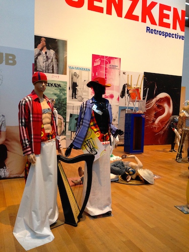
Early in her art career, she zigged and zagged and eventually found inspiration in New York, but then who hasn’t? Take a ride at MoMA through the career of an “artist’s artist”, Isa Genzken Retrospective, through March 10.
On a weekend with the bit-of-everything Biennial debut, why not also see work a sculptor who’s done it all herself — tried a little bit of everything on a career-long journey through computerized wood, concrete and electronics, resin, subversive architectural models with ready-mades, and mannequin-and-outfit art. Hey, she’s a one-woman Armory Show!
We have highlights on our Flickr feed, but MoMA’s digital interactive team has done an outstanding chronology of this Berlin artist’s invention over the past 40 years. Click through the show on the web, read the label copy, and enjoy the audio tour.
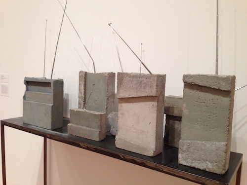
Weltempfänger (World Receiver) (1987–89) mimic the real thing in concrete
What we found interesting: Back in the late 1970s, she wondered what it would be like to design sculptures on computers and ended up making huge wooden sculptures that took collaboration with physicists and carpenters. To put her achievement in perspective, her 1980 sculptures were displayed at a time when the Mac was still essentially a garage project. Good going, girl!
Around the same time, she became captivated by electronics and began experimenting with collages, sculptures, and ready-mades with hi-fi equipment and wideband radio receivers.
Fenster (Window) (1992) installed under a MoMA skylight from which you can see the buildings outside.
MoMA’s installed a spectacular gallery populated with large, high, dramatic, airy structures that she made in the 1990s. Are they windows? Empty stretchers for paintings? Look closely and you’ll see that they are made of see-through resin. It’s all the more mysterious because their tops are reaching up to Midtown’s rectangle skyscrapers visible through MoMA’s own window. (You’ll feel like you’re in Stacy and Clinton’s 360, except it’s reflecting Modern architecture.)
It’s a nice gateway to what lies beyond – a room filled with work inspired by her first trips to New York in 1995-1996. She loved what she saw. She collected mementos of her Downtown travels – invites to clubs, flyers, posters, gallery notices, calling cards – and made them into bright, colorful scrapbooks.
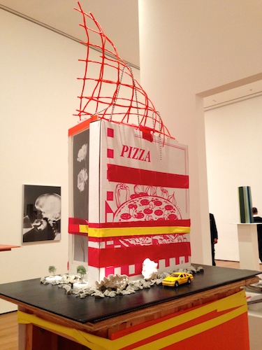
In 2000, she went on another collecting trip from her flat near Wall Street to pay tribute to the City’s world-class skyscraper architecture that so inspired her.
Genzken’s 2000 series that paid tribute to NYC’s modernist architecture. A sly Tatlin touch.
But rather than rely on “substantial” materials to interpret hard-edge Modernist design, she cobbled together vignettes of toy cars, pizza boxes, and other ready-mades holding it all together with brightly colored adhesive tape. (As you walk through her tall plywood stands perusing her cityscapes, watch out for the tiny Hula-Hair-Barbie-wannabe toy standing along the narrow pathway facing the gallery wall.)
And be sure to look up. On the ceiling above, she’s showing a film shot on the noisy city streets, interspersed with tranquil river views of the Hudson.
There’s much more to the exhibit – commentaries on corporate America (featuring Scrooge McDuck) and her phenomenal we-are-all-actors-in-this-crazy-life installation at the entrance. You can’t really describe it.
And don’t worry if you’ve never heard of Isa before, as this MoMA YouTube attests. If you have 20 minutes, take a tour of Berlin, New York, and the Venice Biennale through the eyes of Isa’s fans — Lawrence Weiner, Wolfgang Tilmans, Dan Graham, and a host of German gallery owners, collectors, and curators:
Take a stroll through Isa’s work in person at the Museum of Contemporary Art Chicago (April 12-August 3) and the Dallas Museum of Art (September 14 – January 4).
Remember 17th c. Dutch tulipmania? JAR Tulip Brooch 2008. Rubies, diamonds, pink sapphires, garnets, silver, gold, and enamel. Private collection. Photo: Jozsef Tari. Courtesy: JAR, Paris.
If you took the detailed observational field skills and plant-and-animal artistry of JJ Audubon and crossed them with the gold-and-jewels precision of a Fabergé master, you can understand the enjoyment, beauty, and wonder that await the luxury-lovers crowding into Jewels by JAR, the Metropolitan Museum of Art’s tribute to the world’s most exclusive and reclusive jewelry artist. Meditate on his exquisite take on the natural world before it all goes back to the vaults on March 9.
Plenty of worshippers were wielding tiny flashlights last Saturday night, working their way meticulously through the darkened gallery perusing every detail of 400 tiny, sparkling, jewel-encrusted pieces by JAR (or, Joel A. Rosenthal as he was known growing up in the Bronx). He’s one of the world’s experts in the pavé technique and achieves subtle effects by painstakingly arranging miniscule diamonds, rubies, opals, and amethysts across gold, platinum, and silver surfaces.
JAR’s 2010 bracelet evokes snow on branches. Diamonds, silver, and platinum. Private collection. Photo: Jozsef Tari. Courtesy: JAR, Paris.
Despite being one of the most sought-after jewelers in the world, JAR will not do commissions. Each piece is one of a kind, so the subjects that he chooses tell you a lot about him. Look closely.
The first case features bracelets, earrings, brooches, and necklaces fashioned into exact, delicate replicas of just about anything you can find at the New York Botanical Garden on a spring day — gardenias, roses, camellias, tulips, lilacs, carnations, wisteria, pansies, and even wild oats. Across the room, you’ll see perfect oak leaves and acorns (made from diamonds, platinum, silver, and gold) formed into dramatic rings, cufflinks, necklaces, and earrings.
Growing up, JAR loved roaming the halls of the American Museum of Natural History and the Met, which shows. He’s made one pair of pendant earrings (No. 83) from iridescent beetle wings, married with tiny emeralds, garnets, and diamonds set into silver and platinum.
JAR Butterfly Brooch 1994. Sapphires, fire opals, rubies, amethyst, garnets, diamonds, silver, and gold. Private collection. Photo: Katharina Faerber. Courtesy: JAR, Paris
Right next to that (No. 84) you’ll see his 1981 Egyptian-style faience earrings with emeralds, coral, and gold — a 20th century take on the Middle Kingdom. He’s crafted stalactite earrings (No. 93) from diamonds and silver and found a heart-shaped pebble into which he’s set a perfect ruby surrounded by silver and gold (No. 283).
In the center of the room there are moon and stars pendant earrings (a tribute to Cole Porter) made of sapphires and diamonds (No. 274), and a box (No. 260) inspired by lightning (rock crystal and diamonds). JAR’s 1991 Phases of the Moon Bracelet, made of basalt, diamonds, silver, and platinum, makes you think he probably also hung out at the Hayden in his youth.
The finale to the gallery is the Met’s jeweled twin to the AMNH Butterfly Conservatory – a wall in which 22 of JAR’s beautiful butterflies take flight. OK, there are 2 dragonflies in there, too, but the overall message is butterflies.
A few animals are in the show, too. JAR Zebra Brooch 1987 made of agate, diamonds, a sapphire, silver, and gold. Private collection. Photo: Katharina Faerber. Courtesy: JAR, Paris
Every person in the crowd seemed to pause here in the dark to choose which creature was the most beautiful before entering the bright, unforgiving lights of the gift shop. A personal favorite was the 1987 Dragonfly Brooch (No. 378) with double-layered rock crystal wings.
If you love nature, wit, color, and fool-the-eye magic, you’ll like getting lost in the dark among the billions of points of light that JAR has created in his glittering universe.
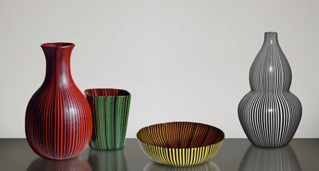
It’s a tribute to one of the top innovators in Murano glass, stepping visitors through more than two dozen styles and innovations that he brought to glass-making, but it also provides a brilliant introduction to the virtuosity that characterized decorative luxury items as far back as the first century B.C. See it before March 2.
Scarpa was inspired by 18th c. Chinese porcelain. Source: The Met
Scarpa, a trained architect, began working as an artistic consultant at Paolo Venini’s glass factory in Venice right after he graduated, but soon his creativity and vision catapulted him into the job of artistic director and into the spotlight with every new collection he debuted at the Venice Biennale.
At the start of the show, you’ll see his Bollicine group (1932-1933) with tiny air bubbles incorporated into each white, blue, black, and green piece. In awe of the artistry of Eastern Asia, he fused this modern technique with a reliance on traditional shapes from one of his favorite periods of Chinese porcelain – the Qing dynasty (1644-1911), where ceramic artists crafted bold, dramatic single-color works. Check. Let’s take a page out of that book and put it to use in creating sleek, modern icons of Italian design.
At the far side of the circular Lehman Wing gallery, the Met curators have put together a shelf that fools you from a distance. You’ll think that the gorgeously modern works are all opaque glass masterpieces by Scarpa, but only half are. The rest are beautifully arranged works from 18th and 19th century China from the Met’s own collection.
Scarpa’s bubble-glass liqueur set (1935). Source: The Met.
Venini and Scarpa felt it was important to document the specific silhouettes that they created, and the Met has matched the archive shape with many of the modern glass works in the collection.
Just look at each label and wonder what the 18th century Chinese ceramicists would think of their shapes being transformed into glass marvels.
Working your way around the gallery, you’ll experience astonishing artistry resulting from dozens of technical approaches – for example, glass with rough, irregular surfaces (Corrosi 1936-1938), glass blown from thin slabs made of alternating clear and colored glass rods (Mecca filigrana 1934-1936), boldly striped pieces, and iridescent glass (Iridati, 1940). The variety and effects are astonishing and it’s easy to float dreamily through this art for art’s sake show.
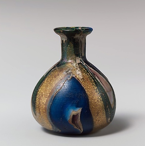
Luxury Italian modern glass from the early 1st century A.D. Source: The Met
The curators also make use of the Met’s vast collection of ancient glass to remind modernists that the glassmaking tradition extends back nearly two millennia along the Mediterranean and Adriatic shores.
Be sure to look for the Met’s cast glass created in Greece between the 2nd century and 1st century B.C. and in Rome from the late 1st century B.C. to the early 1st century A.D. Glass was a super-high-end luxury item back in those days.
You’ll be blown away by how modern it all looks.
This mosaic glass dish may look like Italian 1980s, but it’s Greek from the 2nd-1st century B.C. Source: The Met
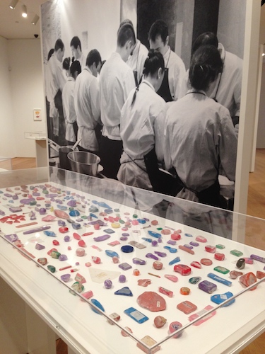
Notebooks and menu drawings from ElBulli’s kitchen displayed in front of a mural of Ferran Adrià and staff in Roses, Spain in the most famous kitchen in the world. Courtesy: elBullifoundation, The Drawing Center
If you weren’t able to visit the famed ElBulli restaurant on the coast of Spain before it closed two years ago, don’t worry. Pop down to Soho to meet the man, his team, and his legacy through The Drawing Center’s provocative show, Ferran Adrià: Notes on Creativity, running through February 28.
Even if you can’t taste the world-renowned creations, you’ll feel as though you’ve entered his kitchen during the six months per year that his team worked on R&D through up-close looks at experiments, plating, techniques, codes, inventions, and graphic treatises. Take a look at the installation on our Flickr feed.
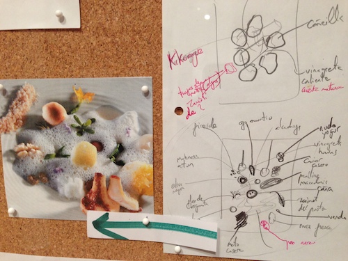
Close-up of large working board of photo and diagrams document the plating and components of each dish. Courtesy: elBullifoundation
Last weekend, the Wooster Street space was jammed with visitors eager to see glimpse the genius behind the magic of the famed elBulli – notebooks filled with diagrams of exacting platings of food, a room inside the gallery evoking elBulli’s Barcelona archive, huge storyboards pinned with drawings and photographs of artist-inspired dishes, and glass-topped tables containing inventions that created some of the most amazing food–art in the world.
Examples: the apparatus that turns cheese into “spaghetti”, the glass bowls used to serve diners “edible air”, or the cocktail device that literally sprays a dry martini right into a diner’s mouth.
240 plasticine models used by staff to recreate precise shapes and portions of artistic dish components.
And how do you keep the beautiful dishes consistent? By making little plastic sculptures so that the kitchen crew knows how to duplicate forms for delicate platings precisely on everyone’s plate. When you’re delivering identical 40-course dinners to guests who have flown halfway around the world to join you for dinner, precision counts.
Improvisation may have happened during the six months of the year that elBulli shut down to devote itself to R&D, but not so much during dining-season crunch time. Just look at the large wall drawing that Adrià sketched for this show — Map of the Creative Process: Decoding the Genome of Creativity. Organization is key.
Last weekend, there were no empty seats in the downstairs video viewing gallery, as visitors sat mesmerized by 1846, the 90-minute film co-produced by The Drawing Center, showing every dish Adriá ever served at elBulli (1987 – 2011).
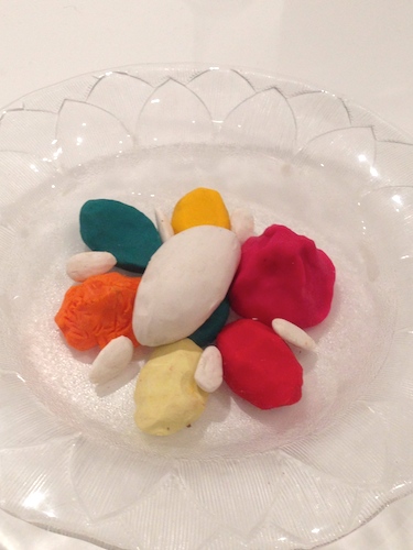
Plasticine model of the 1994 Le Menestra dish composed only of textures, including cauliflower mousse, basil jelly, almond sorbet, avocado, and numerous other components.
Photos of gorgeous, glistening food on plates, rocks, and wood lilted by to an opera soundtrack punctuated by the sounds of water lapping on the shore near the restaurant. Plates of vegetables, seafood slices, sprigs, and flowers wafted by. What are those spoons filled with? What appeared to be “hatching” out of that egg? What was the egg? What was perching on a stalk like an insect? The effect made you feel as if you were seeing life on Earth evolve…biomorphic shapes surrounded by foam.
You could tell that these art-and-food lovers had absorbed the exhibit upstairs when there was a collective gasp of recognition when the real-life version of La Menestra (accurately and lovingly represented in plascticene upstairs) floated onto the screen.
Since he shut the most desired and famous restaurant in the world, Adrià has been hard at work making sure that his thoughts, processes, philosophy, and research were well documented and translated to digital form. Although it’s still in beta, he’s incorporating it all into an online encyclopedia of gastronomic knowledge.
Kudos to Brett Littman and his team at The Drawing Center for mounting a show that pays tribute to food-as-art and shows us how creativity, inspiration, and documentation (in the hands of an genius, or team of geniuses) can turn experiments in a kitchen on a small Spanish seaside cove into a global digital export of wisdom and innovation for the next generation of chefs.
Take a look at Bullifoundation’s promo video to see what’s in store:
Happily, this show is going on the road in the United States before it leaves for The Netherlands in 2016: See it at the ACE Museum in LA (May 4-July 31), Museum of Contemporary Art in Cleveland (September 26-January 18, 2015), or Minneapolis Institute of Art (September 17, 2015-January 3, 2016).
Here’s a link to Documenting Documenta, a 2011 film about Adrià’s life, inspiration, work, and participation in Documenta 12, an international cultural festival in Kassel, Germany that happens every five years.