Detail from Flock of Cranes (1767-1784) by Ishida Yutei, a six-panel folding screen
An avian free-for-all is happening on the second floor of the Met’s Asian Wing, with a lot of flapping, stalking, crowing, and displaying for all the world to see through July 28.
The birds (and one big, hairy deer) really come alive in the Sackler Wing show, Birds in the Art of Japan, The curators went into the collections to dig out masterworks featuring dozens of species of birds native to Japan, including medieval to modern clothing, jewelry, paintings, sculptures, ceramics, and baskets. If you’re a bird-lover still wondering whether the AMNH will ever bring back the Birds of the World dioramas in all their splendor, you’ll find comfort on examining all these species close up in the quietude of the Met,
The exhibition starts behind the 12th century Buddhist temple platform and just past the 13th Century Bodhisattvas, where you’re greeted by a charming rooster that’s actually an 18th century incense burner. Turn the corner and you’ll come face to face with a startling 2011 Japanese sculpture — Kohei Nawa’s PixCell-Deer#24, an auspicious presence (ref. the messenger animal of the Shinto deities) in the form of a taxidermy specimen that Kohei creativly covered in glass bubbles.
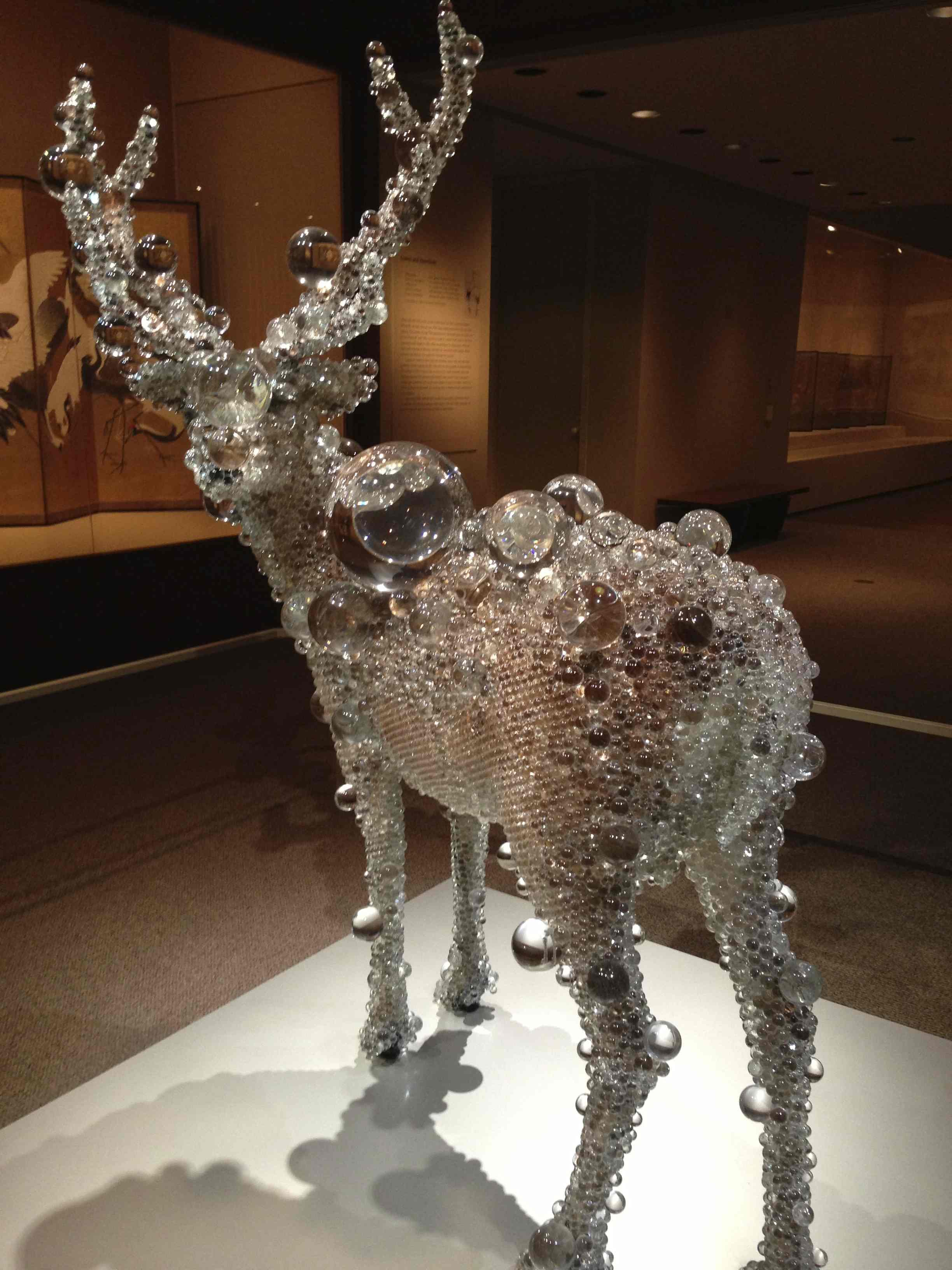
How did Kohei Nawa’s deer get in here?
Every gallery delivers a surprise, from the water birds area right through to the “exotics”. Exquisite paintings of the 1700 are interspersed with startling realistic works by the masters of the forge. One of the show-stoppers is a spectacular life-size iron eagle hovering from his perch in the raptor gallery that the curators reckon was made for display at one of the late 19th century world expositions. The detail is amazing. Each feather was forged and riveted individually onto the bird’s metal body. It’s no wonder that the eagle, a nearby raven, and another headdress normally live in the Arms and Armor Department at The Met. Nice collaboration!
Check out our Flickr site for a walk-through of some of our favorite works, including the embroidered Phoenix-covered kimono, the 1908 Peafowl painting/screen by Mochizuki Gyokkei, Asano Toshichi’s hawk-shaped zither, and Kamisaka Sekka’s artistic book, which is brilliantly displayed in interactive form by the Met’s digital team.

Spectacular iron eagle lent by Arms & Armor Department
Enjoy this wildlife walk through the eyes of artists on the other side of the world, and be sure to relax in the George Nakashima reading room – a kind of “fire pit” roundtable where we found visitors sharing their impressions of the show. Check out the Met’s on-line catalog of the exhibition, but do yourself a favor and hike over to the Met in the next month before these birds fly away back to the collections.
You won’t be seeing the birds in the wild, but it’s likely that J.J. Audubon would approve. You’ll find joy in getting to know your new Asian friends, who you will likely spot in future exhibitions or in the aviary at the zoo.

Kimono embroidery detail. What did the Phoenix signify to this 19th c. bride?