Crowds surround Kara Walker’s monumental sugar sculpture
The crowds lined up yesterday on Kent Avenue all the way beyond the Williamsburg Bridge, almost to Schaeffer’s Landing, waiting to enter the rusted, aromatic, tumble-down confines of the old Domino Sugar Factory on one of the last days to see Kara Walker’s “A Subtlety, or The Marvelous Sugar Baby”, commissioned by Creative Time.
Today is the last day, so take a look at history in person, on our Flickr page, or in the video below.
Security was in full force to keep the Williamsburg bike path clear and drivers were slowing down to ask, “What’s going on and what are people waiting for?” only to be told by patient fans, “They’re lined up to see art!”
Once inside, the marvelous, gigantic Sugar Baby sculpture was on hand to preside over the far end of the abandoned several-block-long 1851 industrial space that once refined over half the sugar consumed in the entire United States.
One of her many attendants throughout the factory
As readers of Friday’s front-page article in The New York Times knew, Walker was again pushing the buttons with her homage to the brutal history of the sugar trade from the 1700s until today by giving us an experience that isn’t really all that sweet. Witnessing Kara’s witnessing is what had people – including some elderly visitors on canes — flocking to the sticky-floored, slightly ominous space. You could smell the sugar and molasses before you even entered the door.
Leading up to the gigantic white sculpture, people encountered all sorts of molasses-children, toting baskets full of…well…looks/smells like molasses. The experience evokes everything that Kara wished for…history, economics, society, race, abuse, industrial profit, and industrial scale.
Take a look at how it was made, and read about the history behind her thinking. Click on this link to Vimeo, look on the Creative Time website to see her sketches and graphic inspirations, and be sure to check out the various stages of Kara’s 3D digital sphinx up close.
If you go to Brooklyn today, expect to wait about an hour in line; once inside, there’s plenty to think about.
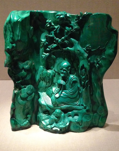
Converse had to have this tiny green malachite sculpture of a teacher seated in a grotto.
The tiny show in the upper gallery at the far, far end of the Metropolitan Museum’s Asian Wing shows just how far two industrialists would go to collect eye-popping dazzlers from 18th and 19th century China. Colors of the Universe: Chinese Hardstone Carvingsruns through October 9, 2017.
The curators want you to now that intricately carved and polished stones from China’s Qing Dynasty go way beyond green and white jade to the blacks, tans, reds, oranges, roses, and blues of a wide variety of stones available to the Chinese 18th and 19th century artisans — malachite, chalcedony, amethyst, coral, lapis, and carnelian. See them all lovingly displayed in Gallery 222.
Look at our Flickr page, and check out other images in the Met’s photo gallery. If you can get to the Met, walk all the way to the end of the Asian wing on the Second Floor and take the stairs or elevator up. When we visited, there were no shortage of Asian tour groups filing through and snapping photos.
Who wouldn’t want to have a miniature Peanuts and Jujube Dates carved from chalcedony? Heber Bishop bought this. It’s just over one inch high. 18th c. China
The ancient art of Chinese stone carving reached its zenith during the Qing (1644-1911), known in movies and pop culture as the Manchu Dynasty. It was a time when emperors painted and wrote poems, the Peking opera was born, and culinary culture (tea ceremonies and gourmet dishes) rivaled today’s elevation of foodie culture. Scholars and the highly educated upper classes went to town outdoing one another with ink, paper, and acquisitions.
Qing craftsmen enjoyed lots of royal patronage, and any materials required to produce something fantastic – including colorful stones — were available. Although this show includes personal jewelry and a few carved pots and brushes used by high-end scholars, the focus is really on the “look at this” display pieces.
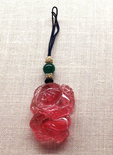
Tiny pendant in the Shape of a Boy, carved and polished tourmaline
These fantastic pieces were mostly acquired by two powerful industrialists of 19th century and early 20th century New York. Colorful miniature landscapes, lions, kids, fruits, vegetables, and seafood were irresistible.
Several stunning pieces were bequeathed by Edmund Converse, an industrialist-collector who otherwise focused on big jade and European oil paintings. But even when his stuff went to the Met in 1921, the curators noted that the quality and delight of his assemblage of little colorful non-jade Chinese hardstones.
But most of what you’ll see in Gallery 222 was collected and given to the Met by Heber Bishop, an industrialist who began in the Cuban sugar business in the 1860s, but later went on to many other industries (gas, iron, and railways) and was one of the backer-builders of New York’s Third Avenue El.
Bishop could not resist a tiny polished lapis lion with a little cub peeking out. It’s just over 2 inches high.
Like many cultured gentlemen of his time, his passion for anthropology and collecting found its end-point in many NYC institutions. He went everywhere and bought everything, including vast amounts of Asian textiles, lacquers, bronzes, swords, and ironwork, but he was crazy for jade. Eventually his collection surpassed any of the jade collections of European museums, and he decided to make a big donation to the Met.
Although there doesn’t seem to be any sign of it now, he made the donation on one condition – that the magnificent pieces be housed in a room that was an exact reproduction of his ballroom at home where it had been so lovingly housed.
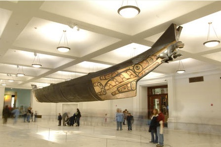
Who knows what became of that idea 100 years later, but we know that one of Bishop’s biggest buys did get it’s own room across town: Any day of the week at the American Museum of Natural History you can admire the spectacular 64-foot Haida canoe transported from Bella Bella, suspended in the recently spiffed-up Grand Gallery on AMNH’s First Floor. Although it’s wood, it’s carved from a single piece, just like his little Chinese stones.
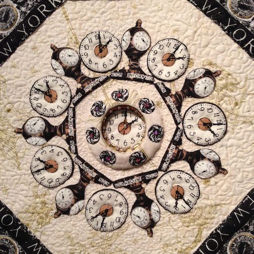
Center detail of Grand Prize quilt by Baltimore’s Amy Krasnarsky, Time Flies, But We Take the Train
When you’re used to seeing large, magnificent quilts at the American Folk Art Museum, it’s a bit of a surprise to confront so many small ones as you walk through the doors of the New York Transit Museum’s annex to view the Grand Central Centennial Quilts exhibition (through July 6). But they’ve arrived from 15 states as part of a nationwide challenge to quilters to use some custom-designed fabric featuring Grand Central’s zodiac sky to say “Happy 100th Birthday” to our favorite transit hub.
A competition run by The City Quilter, a gallery and quilting emporium on West 25th Street, and American Patchwork & Quilting Magazine, inspired more than 80 quilters from 25 states to design, piece, stitch, and embellish creations that evoke the historic space. Everyone had to make a quilt to the same dimensions and incorporate the custom-patterned fabric designed by The City Quilter, “GCT Constellations” (the zodiac ceiling) and “Grand Central” with many of the terminal’s most iconic architectural elements.
Center detail of First Prize quilt, Grand Central Terminal Mandala, by Ligaya Siachongco
You’ll see 30 of the best – three winners, nine honorable mentions, and other top finalists. Pop into the Annex and take a look.
The Grand Prize went to Baltimore’s Amy Krasnarsky, who used Beauty Blocks, sequins and trapunto to evoke the people who have trod those marble floors over the last 100 years. Amy worked in the acorns and oak leaves, which the Vanderbilt family chose to be their symbols and which are embedded in every nook and cranny of the lavish terminal. Once you begin looking, you’ll see them everywhere.
Ligaya Siachongco of Woodside, Queens, won First Prize by creating a mandala from the terminal’s architectural elements. Look carefully and you’ll see the exacting bead and applique work. The central clock appears “hidden” within a mysterious, secret space.
Abstract Second Prize quilt by Beth Carney of Yonkers, Chasms 16: Under the Stars
Abstraction was rewarded in Beth Carney’s lyrical interpretation, Chasms 16: Under the Stars.
She used sinuous, meandering stitched lines to evoke the passersby, train lines, veins of marble, tracks and tunnels – everything she sees when she travels down to the City and through the GCT from her home in Yonkers.
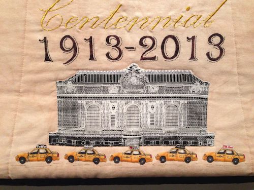
Hudon, Ohio’s Nancy Gary received an Honorable Mention, but achieved something quite unique – simultaneous views of the interior and exterior of GCT. Her quilt accurately conveys the dramatic interior of the terminal and those magnificent windows while also showing us the line-up of taxis along the 42nd Street stand. Everything is where it should be, including the black square on the ceiling – the tiles left by the restoration crew to show just how sooty the interior marble and zodiac ceiling used to be.
Detail of Kim Gimblette’s quilt, focusing on GCT’s track diagrams and the future East Side Access
Kim Gimblette of Ossining, New York, was one of the few that paid tribute to the track diagrams. She even added one in a different shade to represent the future of the station – the mighty East Side Access project that will eventually bring the Long Island Rail Road trains into Grand Central.
We couldn’t resist posting photos some of these amazing details here on the blog page, so go to our Flickr album to see the full-scale designs. The City Quilter’s Flickr page shows each of the artists next to their work. Click here to read each artist’s comments about their quilts.
Does this make you nostalgic for New York and wonder about what you’d create? If you have some time to sew, go to City Quilter’s on-line shop and order some NYC-themed fabrics. Get inspired by cotton yardage featuring the Big Sky of Grand Central (two color ways), architectural landmarks, the skyline at night, subway train cars, and – in case you wanted to channel a little Damien Hirst crossed with NYCT – subway dots of all the lettered and numbered lines.
Detail from Nancy Gary’s quilt, featuring the taxi stand and so much more
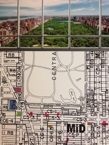
A photo of the future view from an apartment in One57, with the Midtown zoning map. Source: Skyscraper Museum
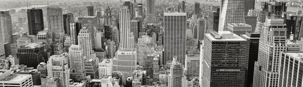
People get pretty emotional about their New York skyline. Recent news has swirled around Comcast wanting to put its name atop Rockefeller Center (goodbye, G.E.), the soon-to-be obstructed view of Manhattan from New Jersey’s Lincoln Tunnel entrance, and the super-slim ultra-tall residential skyscrapers sprouting up along the south edge of Central Park.
What’s going up at Hudson Yards? Will more sky-high slivers be overtaking the Empire State Building? The downtown skyline? Thankfully, the Skyscraper Museum is walking us all through the plans in its show, closing this weekend, Sky High & the Logic of Luxury. In a fantastic on-line and in-gallery show, the museum lays out the thinking behind six super-tall residential real estate developments, gives us the historic context of tall buildings here, and introduces us to the architects and developers behind the trend.
Stars of the show, left to right: 432 Park Avenue, One57, 111 West 57th, Four Seasons at 30 Park Place, 56 Leonard, Hudson Yards Tower D.
The show – both in the museum and on the web – begins with a definition of “slim” skyscraper and the long history of super-skinny in Manhattan. The history goes as far back to 1889 with the super-tall (at eleven stories) Tower Building at 50 Broadway – the beginning of the first phase of super-slim buildings. The MetLife Tower, finished in 1909, still towers to the east of Shake Shack at Madison Square. (Note, however, that the clock face is the only original part of the exterior left after a 1960s renovation.)
Illustrations of the world’s tallest skyscrapers in 1899 to 1918, all in Manhattan.
After New York’s zoning laws went into effect in 1916 (the first in the United States), hotels started growing taller and skinnier (e.g. the Sherry Netherland in 1927, the Pierre in 1930). Residences didn’t get that way until much more recently with the post-1961 legal change that allowed developers to buy air rights and build really high.
Enter Trump in the 1980s with multiple residential towers covered in dark glass, and the super-tall building (One Madison Park) that went bankrupt during the recession. But now, the entire movement is gaining steam again, with prices, views, and amenities reaching higher and higher.
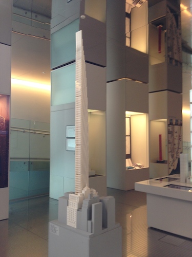
Architect model of 111 West 57th Street soars over surrounding buildings
And, of course, some will be encircled by the High Line Phase III, such as Hudson Yards Tower D.
Take a look at the fantastic, detailed museum exhibition site and get to know your new neighbors.
Be sure to zoom in on the chart on the museum’s web site, showing the history of Manhattan sky-high apartment prices. Also, check out our Flickr photstream of the museum show.
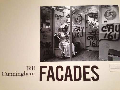
Cunningham’s photo of Editta Sherman in period dress on a 70s graffiti-covered subway car going to a shoot at the Brooklyn Botanic Gardens
Uber-fashion documentarian Bill Cunningham had a great idea in 1968, just as NYC was sliding toward financial crisis, crime, and (goes without saying) neglect of architectural sites, like Grand Central. Why not celebrate two centuries of NYC fashion and splendor on the street?
What were people wearing when some of the City’s most iconic homes, churches, and public buildings were built? Was it possible for a black-and-white photograph to reveal some new insight about the City from combining fashion, architecture, and a little fashion flair and attitude?
Editta poses for Bill in embroidered frock coat and breeches in front of St. Paul’s Chapel, the oldest church building (1766) in Manhattan
Results of Bill’s eight-year project are on display through July 15 in the Bill Cunningham: Facadesphoto exhibition on the second floor of the New-York Historical Society.
Without the aid of Wikipedia, he researched the years that some of his favorite historic places were built, and began scouring thrift stores for get-ups from the matching decade. He enlisted his muse, Editta Sherman, a fellow photographer and neighbor at the Carnegie Hall studios. For the next eight years, Editta and Bill went on weekend odysseys throughout the City, modeling and documenting over 500 historic outfits in front of interesting but sometimes forgotten facades.
In 1976, Bill gave 88 of his silver-gelatin prints to NYHS – the core of the current show, which is hung to emphasize the chronology of fashion and architectural style. The show was jammed with fashion lovers last weekend, soaking in the details from Bill and Eddita’s journey back in time.
Editta dresses for Bill in Gertrude Vanderbilt Whitney’s own Callot Soeurs at the 1904 Harry Payne Whitney House
It starts with Editta dressed in an 18th c. embroidered coat and breeches in front of the 1766 tower of St. Paul’s Chapel at Broadway and Fulton – the oldest church building in Manhattan that was considered “suburban” when President Washington lived here. Remarkably, they discovered this satorial gem in a Ninth Avenue second-hand store.
The visual treats just keep coming – a diaphanous Empire muslin on a model in front of City Hall (1803), Civil War-era frocks at Sniffen Court in Murray Hill, bustles and parasols at the 1884 Villard Houses (Helmsley Palace), and many spectacular gowns from the Gilded Age. Consider Eddita channeling “Diamond Lil” in front of 1891 Delmonico’s, the first modern American restaurant that innovated a la carte dining, private dining rooms, Lobster Newberg, and Baked Alaska.
In two photos, the team managed to borrow some historically relevant gowns – Gertrude Whitney’s Callot Soeurs frock for the shoot at the 1906 Payne Whitney home by Stanford White (Fifth & 79th) and Mrs. J.P. Morgan’s Worth gown at the gazelle gates of the Apthorp.
Bill Cunningham’s take on modern fashions at the 1968 GM Building
The curators note that although women’s fashion in the early 20th century was fairly liberating, the public architecture of New York remained tightly classical. The show’s final shots soar with the optimism of the modern – the “New Look” in front of the Paris Theater (1948), full-skirted flair on Park Avenue by the Lever House (1952), Givenchy at the Guggenheim (1959), and mod looks at the GM Building (1968).
You will savor every minute of your journey with these creative geniuses. Check out a few photos on the NYHS web site, find a copy of the 1978 book Facades, or get to the show.
If you didn’t see the film about Bill, rent it from iTunes or Netflix or buy the DVD. You can glimpse Eddita (a.k.a. The Dutchess) in the movie trailer below:
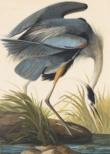
Audubon’s Great Blue Heron (Ardea herodias), Study for Havell pl. 281 (1832). Watercolor, graphite, and pastel on paper, laid on thin board. Courtesy NYHS and Mrs. Audubon
If you need to get out of town Memorial Day weekend, there’s no better traveling companion than J.J. Audubon, whose original watercolors will transport you to another time and place better than any plane, car, or train. Experience his spectacular show at the New-York Historical Society, Audubon’s Aviary: Parts Unknown: Part II of the Complete Flock today and tomorrow.
Can’t make it in person to New York? Not a problem, because you can tour Mr. Audubon’s show (and more) on a fantastic website that shows you his birds, provides the maps of your journey, and more. True, you won’t enjoy the life-size paintings – shocking when you see them in person – but you’ll learn the entire backstory of JJ’s trips through the Southeast US and Northeast Canada as he did the best-job-ever for his epic Birds of Americafour-volume series.
In the NYHS gallery in the last several weeks, visitors have been running up to the second floor and grabbing the magnifying glasses to study each brushstroke of these magnificent works. Although they’re mostly watercolor, each painting is enhanced with graphite, pastel, gouache, and ink. Because no one’s perfect, a few have birds pasted in from other pieces of paper, but you really can’t tell unless you study them closely.
A second Great Blue Heron (1834), thought to be another species at the time, with the skyline of Key West, Florida. Courtesy NYHS and Mrs. Audubon
It’s the first time that NYHS has exhibited JJ’s complete watercolor series, but it’s so big – 474 original watercolors – that they had to break it into three separate shows.
Mrs. Audubon presented JJ’s entire set of original work to NYHS in1862. Her husband had worked so hard on these works of art (he didn’t consider them “scientific”) that she commented that sometimes the birds felt like “her rivals.” Better that NYHS preserve them for posterity.
The museum decided to mount the watercolors in the order in which JJ painted them. On the website, you can revisit Part I, but let’s turn our attention to Part II.
As you’d expect from his trips to the Carolinas, Georgia, Florida, Labrador, and Newfoundland in 1831-33, the majority of the birds you’ll see live in and around the water. Two spectacular works are of the Great Blue Heron in two color ways. In JJ’s lifetime, the white- and bluish-colored herons were thought to be two separate species (which they’re not), so we’re treated two very large paintings of one fishing from shore and the other enjoying a meal in sight of the Key West skyline across the bay.
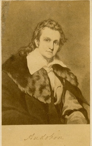
Carte–de–visite of John James Audubon. The legacy lives. Courtesy: NYHS
It’s amazing to consider that JJ started many of these while he was on his journeys, totally outdoing Banksy as a premiere peripetatic creating-art-wherever road warrior. Of course, he did it all without electricity and frequent-flyer miles hauling around gigantic pieces of perfect paper.
Through it’s collaboration with the Cornell Ornithology Lab, the NYHS provides (on the web and on the gallery audio guides) clips of each bird’s distinctive voice. Another nice in-gallery touch is an iPad app that allows visitors to compare each watercolor with the engraved print made in London by Robert Havell, Jr. for the printed books.
If you’ve never gotten to see Canterbury Cathedral, pop into Radiant Light before May 18 to see six magnificently restored Romanesque windows from this historic site, installed appropriately in the Romanesque Gallery near the entrance of The Cloisters.
It’s the first time any of stained glass windows from Canterbury have left home, so it’s a unique chance to gaze upon brilliant, beautiful works designed and made in 1178-1180 and think about the fact that these were seen by Chaucer and millions of pilgrims who trekked to this site over the centuries. Maybe during your trip to the wilds of Fort Tryon Park in northern Manhattan, you’ll act out your own CanterburyTales adventure.
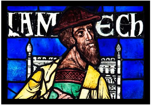
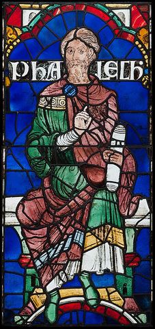
Phalech, one of Noah’s descendants, one of Canterbury’s original 86 stained-glass panels (1178-1780)
The Cloisters got the chance to display these medieval masterworks after a brief run at The Getty while the walls of the Canterbury Cathedral were being restored. Lucky us.
The backstory: After King Henry had Thomas Becket killed at Canterbury in 1170, word spread of miracles in 1171, the fastest canonization in history followed in 1173, and pilgrims began flocking to Becket’s former home. A fire in 1174 triggered Canterbury’s rebuilding and redesign, including the plan for an unprecedented series of 86 stained-glass windows to emphasize the connection of priests (versus kings) to Christ.
At the Cloisters, you will see six of the 46 surviving choir windows depicting the Biblical ancestors of Christ, as chronicled in the Book of Luke.
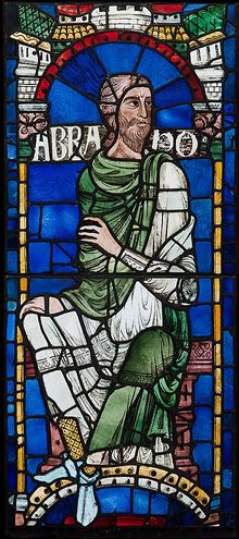
The patriarchs that you’ll meet uptown are Jared, a fifth-generation descendant of Adam; Lamech, the son of Methuselah and father of Noah, who lived during those sinful pre-Flood times; Noah, who appears to be talking to God; Phalec, who lived five or six generations after Noah; Thara, Abraham’s father who hailed from the ancient city of Ur; and Abraham himself.
Abraham with his border back around him again after 200 years
Several full-body portraits are reunited for the first time in 200 years with their original stained-glass borders, which mimic those of contemporaneous manuscript illuminations. Phalech’s portrait has a little less detail than the others, and the curators speculate that the artisans may have had to rush a bit to finish this monster-sized commission on time for the Archbishop back in 1180.
Spoiler alert: The faces of Thara and Abraham are 20th-century copies.
How were these painted? How were these images made? The Cloisters points us the four-minute video below, created by London’s Victoria and Albert Museum to show how medieval artists created their magic.
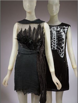
Rodarte’s California condor-inspired evening dress (2010) (left) next to their chest X-ray dress for Target (2011) (right)
In contemporary times, you can’t really have a fashion trend unless you can get the items for your total “look” at H&M, Topshop, Macy’s, Nordstrom Rack, or another mass-market ready-to-wear site. Not everyone is fortunate enough to have designers send stuff over for a red-carpet look.
FIT’s wonderful Trend-ology exhibition acknowledges that although trends today may start from celebrity looks in magazines or on TV, they often arrive fairly quickly at Target, Zara, Express, and other shops. The pace of knock-offs has increased due to the mania for trend, faster speeds in shipping containers across oceans, and “instant” digital media.
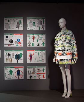
As soon as you enter the upstairs gallery, FIT features a wall of 2014 trend data from consultant WGSN right next to an “on trend” ensemble from Opening Ceremony.
WSGN trend analysis and “on trend” Opening Ceremony ensemble (2014)
You see at a glance how WGSN parses global runway shows each season into key looks, colors, tones, flower shapes, and skirt lengths for ready-to-wear company clients. Without detailed Paris-NY-Milan-London catwalk analysis, how would anyone know what was “trending”?
Spoiler alert: from the analysis depicted here, autumn/winter 2014 is all going to be all about pastel blue, the slip dress, hand-drawn patterns, and midi-length skirts.
There’s also an iPad streaming coverage of the latest award-show red carpet right in front of side-by-side ensembles by the Rodarte sisters – one from their 2010 high-end couture line and one from their sold-out line for Target in 2011.
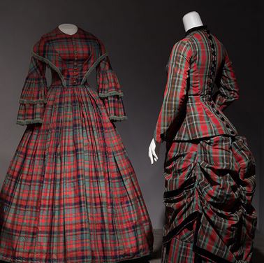
19th century passion for plaid in silk dress (1852) and wool bustle dress.
The curators have stuck two former “it” bags in front of you, too – one from Fendi and the other from Murakami’s colorful collection for Vuitton.
A photograph from a look at Celine’s Fall 2013 collection is mirrored on the mannequin behind, who sports an identical look that’s being marketed to the masses at Zara.
From the vintage looks in the rest of the galleries, the curators prove that trends mattered in the last few centuries, too. Neon yellow hues became the rage in the late 1700s due to the proliferation of imported Chinese silks.
Plaid mania was inspired by Queen Victoria’s Highlands flings at Balmoral Castle in the 1850s, and the craze for mass-produced paisley proliferated throughout the 19th century, following the invention of the Jacquard loom.
Dior “New Look” (1950) (left) inspired Anne Fogarty to create a full-skirt dress for budget-conscious homemakers in 1954 (right)
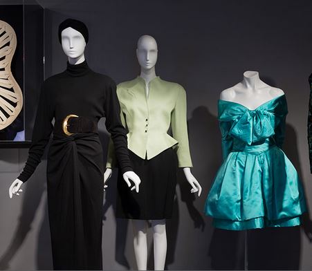
Of course, most of the galleries showcase trends from FIT’s vast archive of more recent fashions – Hollywood bias-cut silks, jet-set fashions following the British Invasion, disco-era menswear (the wide pant legs and patterned shirts seemed to baffle younger male gallery goers), Donna Karen’s iconic 1980s wrap-skirt-bodysuit, and fashions covered in designer logos from the 90s.
The biggest surprise: That Anne Fogarty’s “housewife” dress owes its genesis to Dior’s New Look. Hey, Lucy! Hey, Ethel!
Strangest item: Halston’s uncharacteristic tie dye ensemble that looks more like a Giorgio di Sant’Angelo than the nearby Giorgio di Sant’Angelo.
Greatest pleasure: Seeing the mini-documentary about the first days of Vogue magazine location shoots in the 1960s, surrounded by mod, space-age Carnaby Street looks.
Eighties trends: Donna’s wrap, Thierry’s cut, and an absolutely fabulous Lacroix
Take a tour of 250 years of trends on FIT’s engaging, dazzling web site.
Yang Jiechang’s Crying Landscape (2003) shares the Gallery for Art of Ancient China with a sandstone stele from the Northern Wei dynasty (489-495) and the 1319 Buddha of Medicine.
Normally, the galleries for Asian Art at the Metropolitan Museum of Art are pretty tranquil. But through April 6, you’ll find them buzzing with contemporary art lovers reveling in the hunt to find the most famous, subversive, subtle works by Chinese painters, sculptors, and digital artists residing amidst centuries-old treasures in the widely popular exhibition, Ink Art: Past as Present in Contemporary China.
The Met gave the Chinese art curators free reign to pluck sly works from the in-house contemporary collections created by Chinese artists over the last 20 years, grab monumental works from private collectors, and mount a tribute to how post-Cultural Revolution innovators parse the traditions associated with centuries-old art making in their ancestral country.
How do the hottest artists on the planet turn calligraphy and inked woodblocks into biting social commentary? Take a stroll through the second floor Asian art wing.
Inspired by Cultural Revolution posters, the letters in Wu Shanzhuan’s Character Image of Black Character Font (1989) have no meaning. Courtesy: Private collector, the artist.
Just past the balcony-bar area, the monumental 1319 Buddha of Medicine mural from Shanxi Province, China, casts a benign presence over the Gallery for Art of Ancient China. But just stage right, two larger-than-life works on paper preview how Chinese artists twist the “then” into the “now”.
Yang Jiechang’s Crying Landscape panels are painted in the beautiful, colorful “old school” flat Asian style but depict decidedly unbeautiful industrial and political subjects. Similarly, Qiu Zhirie’s Nanjing Yangzi River Bridge ink triptych features masterful, large-scale ink-brush technique but uses art-world icons to relay a disturbing story. It’s an installation triumph that will haunt you every time you pass through that room again.
Large-scale calligraphy by many of the artists makes ink-pot-and-brush tradition echo with gestures as large as Rothko’s. In the galleries with meticulously crafted “landscape” drawings and images, you’ll ask how this modern crew managed to produce scrolls with such heft and detail. Take a walk-through of the show through our Flickr site.
In 1995, Ai Weiwei corporatized a Han Dynasty (206 B.C. – 9 A.D.) earthenware jar. Courtesy: M + Sigg, the artist
Along the way to back of the wing, the curators play hide-and-seek, putting Ai Weiwei’s “enhanced” Han Dynasty jar right in the aisle with the “unmodernized” earthenware vessels, and mounting Hong Hoo’s subtly colored, hilarious historical “atlas” silkscreens in a case that practically dares unfocused visitors to pass them by as they drift toward the Astor Court.
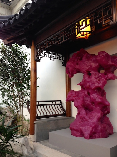
Hopefully by the time they get to the rock garden they will notice Zhang Jianjun’s crazy pink silicone rubber “scholar rock” right next to the real ones. Zhan Wang’s stainless steel scholar rock and Shou Fan’s side chairs are beautifully arranged in the Ming Dynasty room just off the Court, along with more of Ai Weiwei’s furniture hijinx.
After you’re done getting a feel for how the galleries have been transformed, go back into the Met’s exhibition web site to study the brushwork and details and get to know some of the artists.
Zhang Jianjun’s 2008 silicone rubber ScholarRock (TheMirageGarden) sits under a 17th-century pagoda in the Met’s Astor Court. Courtesy: Sigg Collection, the atist
Although the web site appears to be more plain-vanilla than jazzy, you’ll be surprised to see that the digital back-end of the Met archives lets you zoom into each of the paintings to see the handsome handwork of each of these wunderkinds from each thematic section of the show. You can even peruse the gigantic scrolls up close, section by section.
The video room, where art lovers can relax and watch a rotating collection of work, is a nice touch. The modern digital sign to the side tells you exactly where you are in the rotation.
Here’s a link to one of the featured videos: Get to know the constantly transforming cityscape of Beijing through Chen Shaoxiong’s 2005 Ink City, and see what happens when a contemporary artist paints daily life in Beijing with traditional tools and ports his day-to-night experience to video.
The 1980 version of The Perfecto, which debuted in 1928 and is still sold by Schott Bros. Source: FIT
The FIT fashion and textile grad students always pull out the stops on their shows in the Museum at FIT’s side gallery, turning mini-shows into main events, as in their current exhibition, Beyond Rebellion: Fashioning the Biker Jacket. The gallery installation highlights the jacket’s role in history, culture, couture, and street fashion, but the team makes its history come alive even further on their superb companion digital site featuring photos, videos, and the historical context. See the jackets in person and touch the leather swatches before April 5, and go play with the web site at any time.
The digital timeline begins with the birth of the motorcycle in the UK in 1902, but the fashion story starts in 1928 with the debut of the leather riding jacket, The Perfecto by the Schott Bros. It’s the template upon which all other cool looks – street, couture, punk, ready-to-wear – are based. It combines the swag of a WWI aviator jackets with the utility and protection needed by one of the original road warriors. Retail: $5.50.
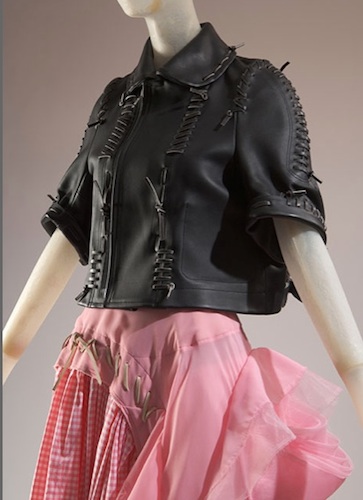
From Rei Kawakubo’s 2005 Biker + Ballerina collection (leather, gingham, and tulle) for Comme des Garcons. Source: FIT.
In the first gallery next to The Perfecto, fashionable visitors were hovering to take in all the information in Paula Sim’s excellent illustrated deconstruction of the jacket’s iconic design features as if it were the Rosetta Stone. How and why did the details we know so well all originate? The asymmetrical zip thwarts wind, epaulets secure riding gloves during breaks, the belt keeps wind from whistling up your back, and zips at the wrist do the same for the glove-sleeve juncture. The extensive use of hardware was a desirable touch inspired by chrome and metal features on the just-taking-off auto industry. Want or need?
It didn’t take long for motorcycle-loving vets to start applying patches and insignias to the aviator-inspired jackets, just as they had done with patches, insignias, and pins during the war. By the 1930s, as shown on the timeline, club patches gradually became associated with “outlaw” clubs. Nevertheless, the popularity of motorcycle riding grew, documented by the curators with a 1951 Sears catalog showing a premium $33.95 leather moto jacket featuring a snap-off lamb collar and “built-in kidney support”.
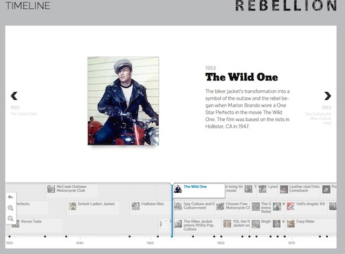
Screenshot from the FIT show timeline
As the curators note, the watershed year for this utility bomber was 1953, when Brando sported cuffed-jeans-and-jacket attire in The Wild One. Banned initially in the UK, the film (and Brando) became a sensation, giving mass audiences a pop-culture version of what happened in the 1947 Hollister, California motorcycle club riots.
The style went viral, pushed further into street-style consciousness by emerging rock-and-rollers and The King himself, Elvis. Take a look at some iconic 50s performances that the digital curators included on the show’s website. Scroll up to 1956 in the timeline to see Gene Vincent tear it up onstage and to 1968 to see Elvis rocking his leather look doing Jailhouse Rockin his NBC comeback special.
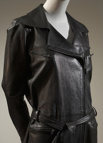
It’s so Schott: Stefano Pilati’s Fall 2009 jumpsuit for YSL. Source: FIT, gift of YSL.
In 1960, YSL became the first high-fashion designer to bring the biker look to the runway – a move that contributed to his exit from the House of Dior. Never mind, though. When he opened his own house two years later, he continued riffing on the bad-girl theme. The rest was history, with plenty of rock musicians, high-end designers, and Vogue stylists following suit.
The curators feature New York’s own Ramones as the epitome of the 1970s motorcycle-jacket-wearing punk-music rebels, and present lots of album covers as evidence of the jacket’s enduring presence.
As for fashion from the FIT collections, the team has pulled together a dozen high-end interpretations, beginning with Mr. Versace’s 1993 gold-stitched biker jacket with pull-tab logo hardware and a more subdued version by Emporio Armani. Fashion lovers have plenty of other versions to savor from Ms. Herrera, Rick Owens, JPG, Rei Kawakubo, and others.
All the techniques rolled into one: Jean Paul Gaultier’s 1987 leather, fake fur, suede, and wool jacket with trapunto, elbow studs, fringe, and pin stripes. Source: FIT, gift of Anne Zartaian.
In the far corner, the team offers a wall where you can touch and compare different types of hides and treatments used for jackets, marvel at the trapunto-on-leather techniques Mr. Versace and JPG used so extensively, and learn that patent leather was invented in 1811.
As for the current popularity of the biker jacket on the Streets of New York, enjoy the slide show by the FIT student team, shot on the only warm weekend day so far this year in Williamsburg:

















 itsnewstoyou