Mucha’s Timeless Legacy of Line

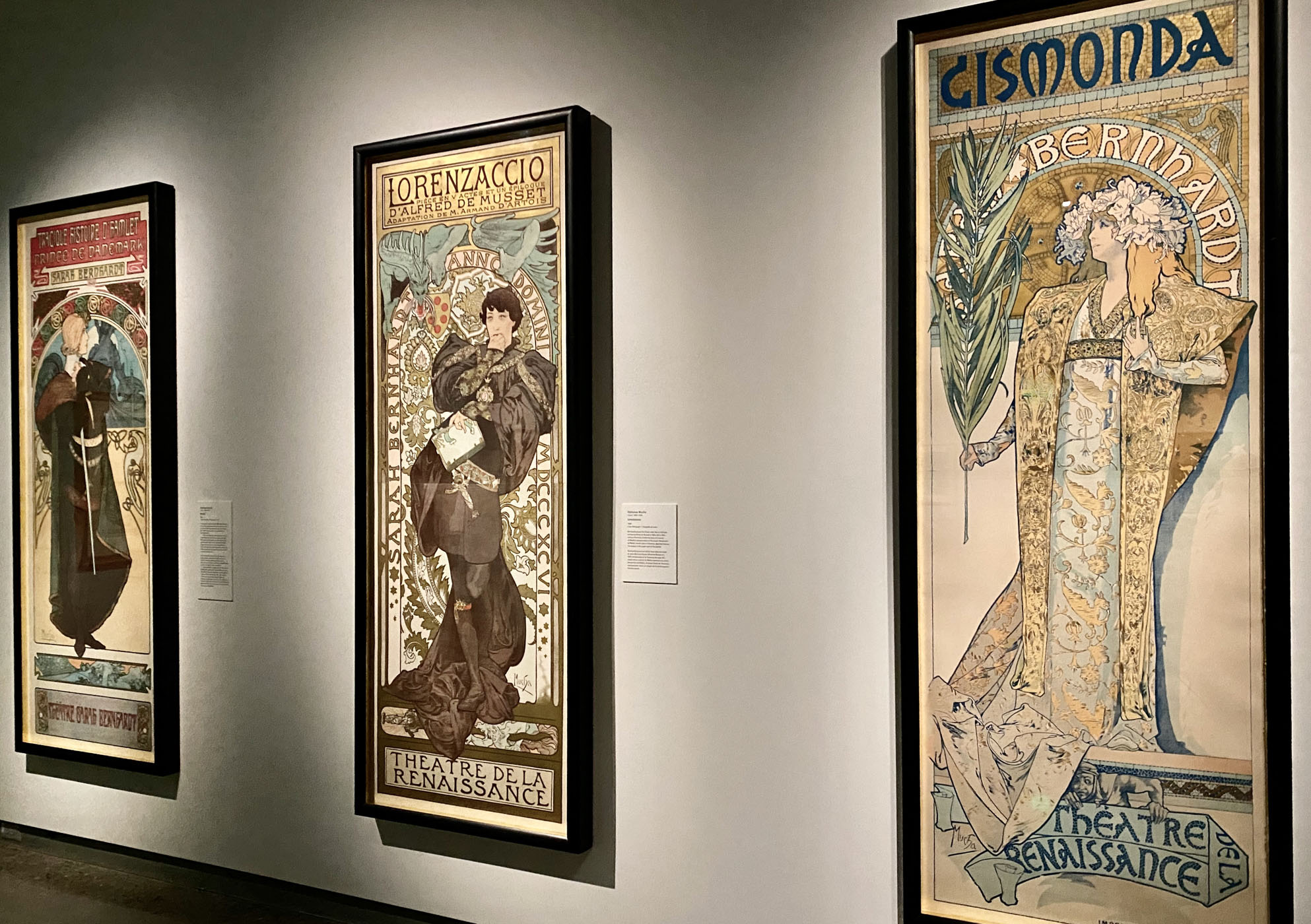
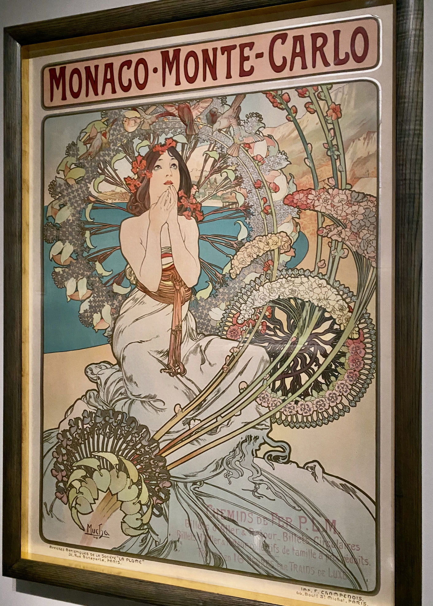
Fans of Mr. Mucha, the grand master of sinuous line, have been lining up across North America to admire some of his greatest works – epic posters of Sarah Bernhardt, beautiful women hawking products surrounded by swirling halos or smoke, and exotic details on small-scale, affordable decorative panels representing the seasons, flowers, or arts.

Created by the Mucha Foundation in Prague, Timeless Mucha: The Magic of Line presents Mucha’s own collection of art and books that inspired his creativity, his early works as an in-demand illustrator, and his most famous posters and viral images. It’s all on display at the Boca Raton Museum of Art through March 1, 2026 after successful stops at the Phillips Collection in Washington, D.C. and Santa Fe’s Vladem Museum of Contemporary Art. 

Mucha’s 1897 lithograph Monaco – Monte Carlo, an ad for the Paris- Côte d’Azur railway featuring a young woman dreaming about her beach trip. Courtesy: Mucha Foundation.

See some of our favorite works from the Vladem installation in our Flickr album.

So how did a designer who was all the rage for Art Nouveau at the 1900 Paris Expo inspire Sixties psychedelic rock illustrators, Marvel Comics creators, and Japanese manga artists? You’ll see that in the exhibition, too. Check out this promo from Boca:

A portion of the exhibit features drawings, sketches, and acquisitions that suggest the building blocks that formed his mature style – Moravian folk style, the mix and match of multicultural design elements seeping into European designers’ consciousness, and the super-flat design in Japanese prints, and fantastical embellishments on Japanese collectibles in late 19th century Paris.

Just take a look at how many of these design influences Mucha packed into his viral street posters advertising actress Sarah Bernhardt’s new plays – mosaics like those in Eastern European churches, exotic decorative elements, and arcs functioning as halos.

Close-up of Mucha’s life-size 1899 poster of Sarah Bernhardt starring in Hamlet, with Celtic motifs. Courtesy: Mucha Foundation.
Close-up of Mucha’s life-size 1894 poster of Sarah Bernhardt starring in Gismonda featuring a Byzantine mosaic, Orothodox cross, and Slavic designs. Courtesy: Mucha Foundation.

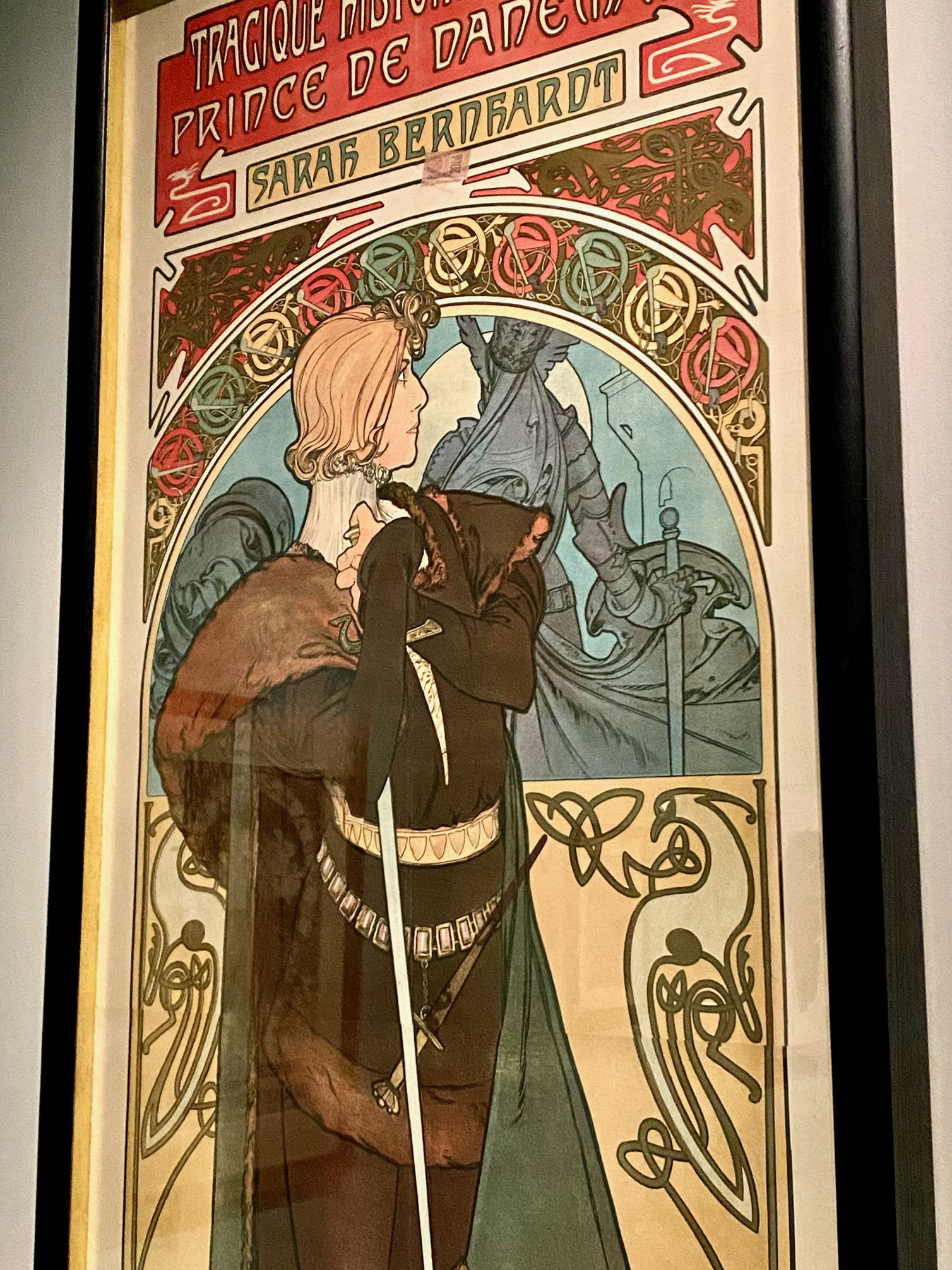
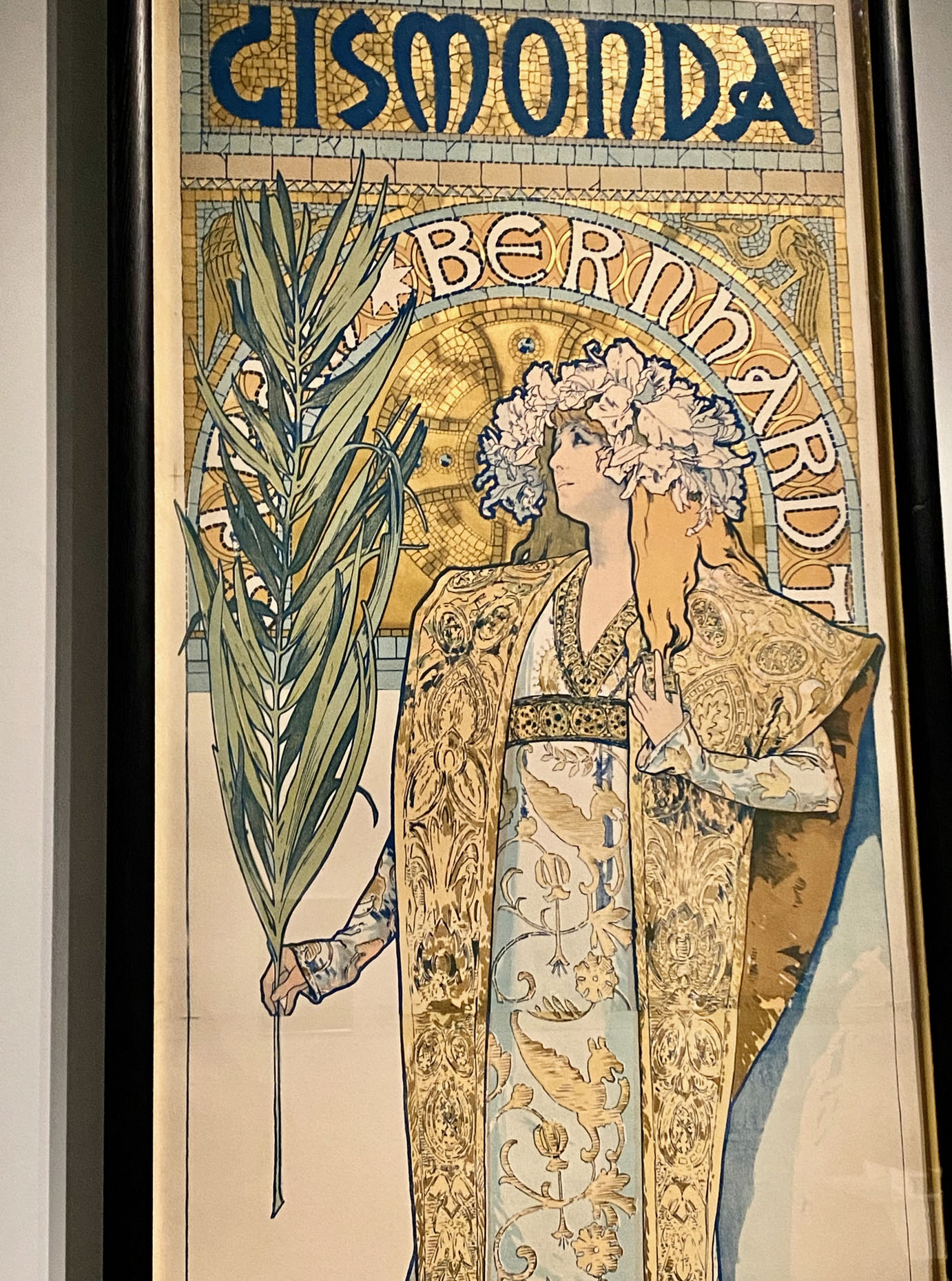
Listen to the Foundation’s curator Tomoko Sato (shown in Phillips Collection galleries) explain how Mucha’s 1894 poster commission – his first – immortalized superstar actress Sarah Bernhardt:

When Mucha’s Gismonda poster appeared on the streets of Paris in 1894, it was a sensation and cemented Mucha’s status as the hottest designer of the day. Bernhardt signed him to a six-year contract (including designing her jewelry), and other offers started rolling in.

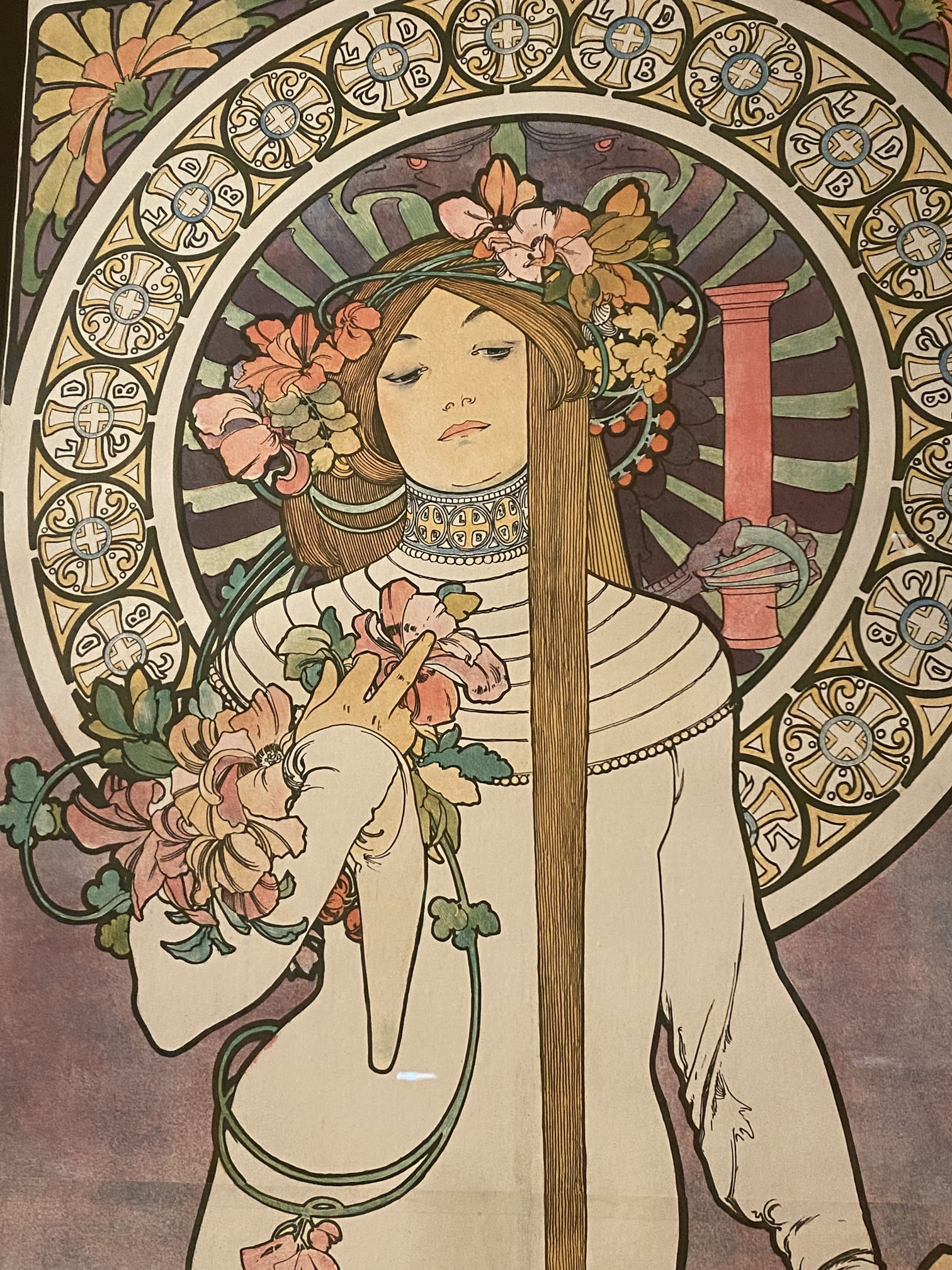
Everyone considered Mucha the leading practitioner of Art Nouveau, although Mucha never cared for this label. As the exhibition shows, Mucha’s style was a flat application with bold outlines around ethereal depictions of independent women, swirling vines and/or hair, and a sinuous spiral curving through his layout.

Detail of Mucha’s 1897 lithograph La Trappestine, a liqueur ad featuring a halo, Celtic designs, and a floral wreath. Courtesy: Mucha Foundation.
Plate from Mucha’s 1902 Documents dècoratifs, his designer handbook on how to combine human figures with decorative elements. Courtesy: Mucha Foundation.

As his fame grew, publishers licensed his images and published them at affordable prices worldwide. Mucha himself traveled abroad, teaching sold-out classes in drawing, line, and figures. He was in such demand that he eventually created books showing up-and-coming designers how to create universally appealing designs in his style.

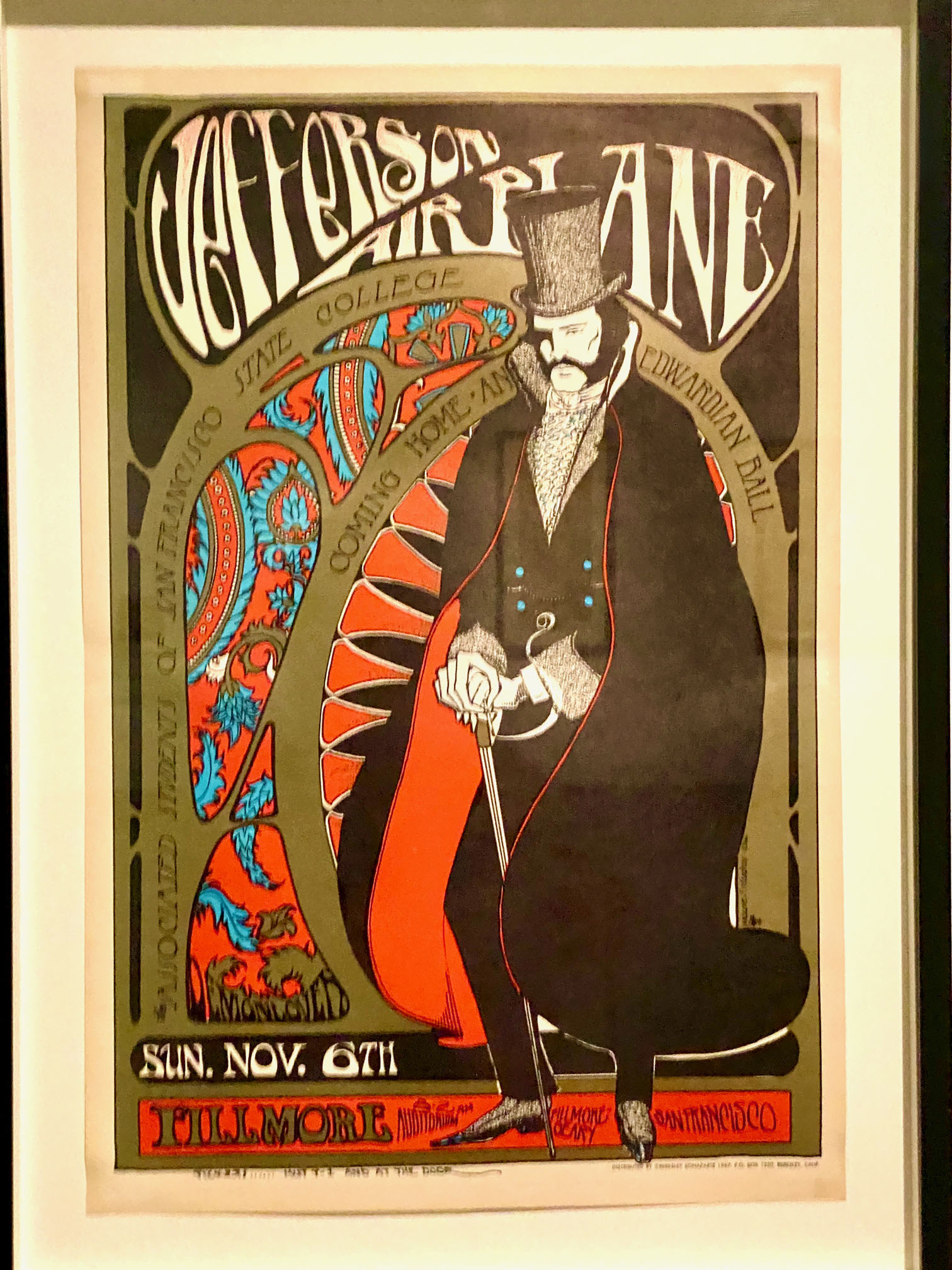
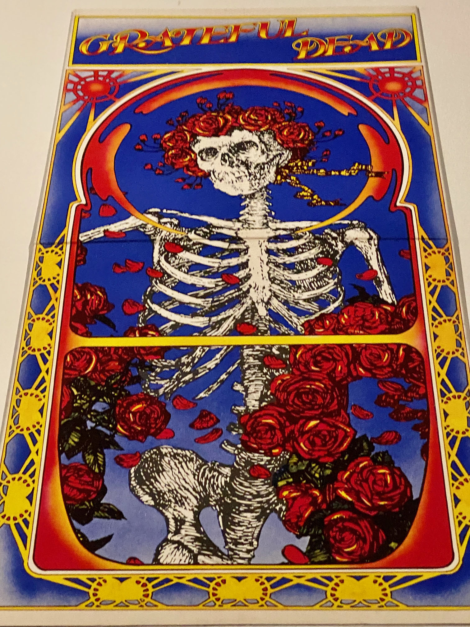
When Mucha produced these design look-books in the early 1900s, could he have envisioned that illustrators and designers of the late 20th and early 21st century would take note? The exhibition showcases Fillmore West posters and Sixties’ rock album covers that repurposed Mucha’s style, such as this transformation of Mucha’s cigarette paper ad into a nearly identical promo for the Jim Kweskin Jug Band.

Mucha’s first product advertising poster – 1896 promo for JOB rolling papers featuring a sensuous smoker and a Byzantine border. Courtesy: Mucha Foundation.
1966 poster by Stanley Mouse and Alton Kelley for a San Francisco concert headlining the Jim Kweskin Jug Band and Big Brother and the Holding Company.

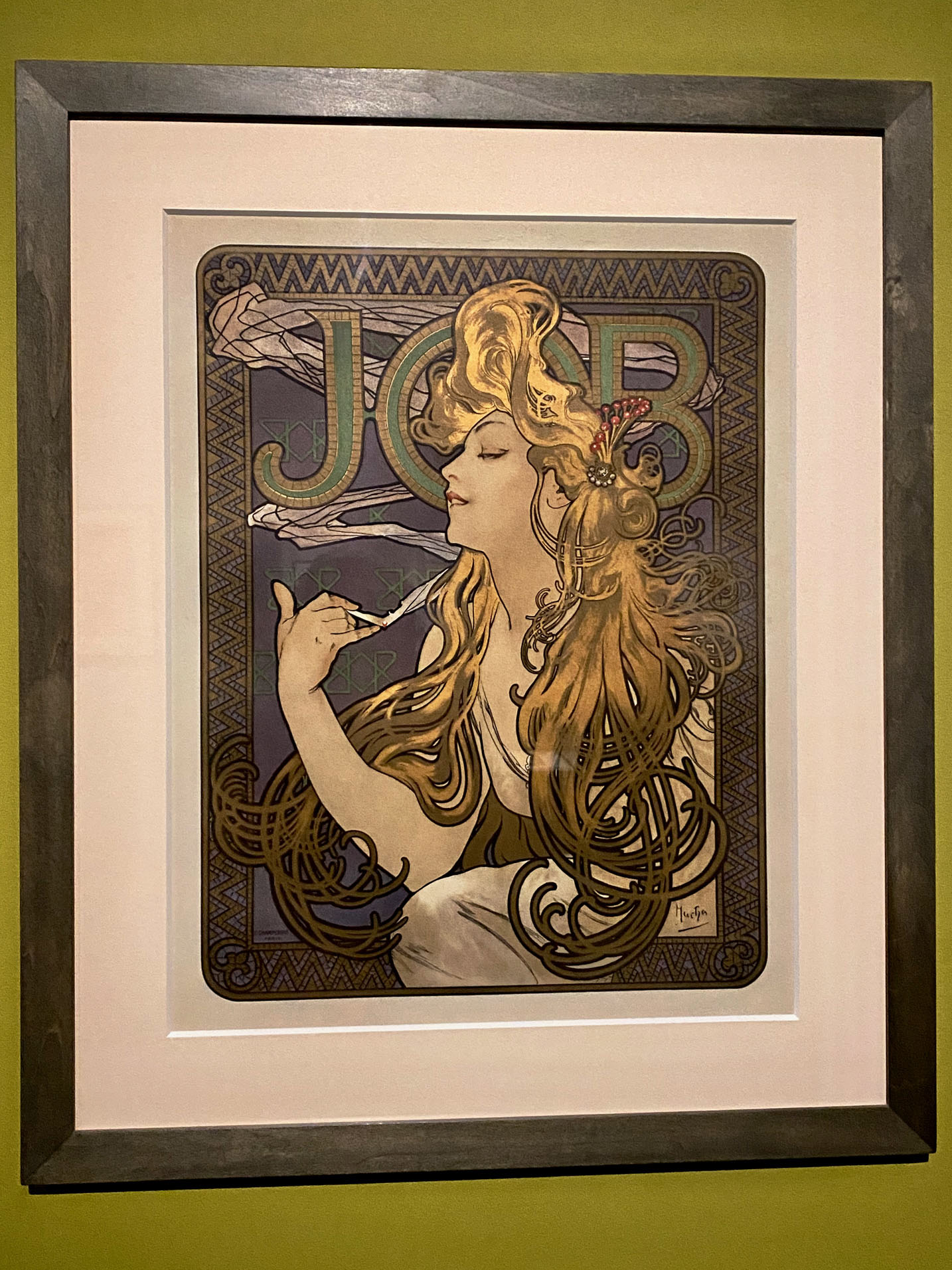
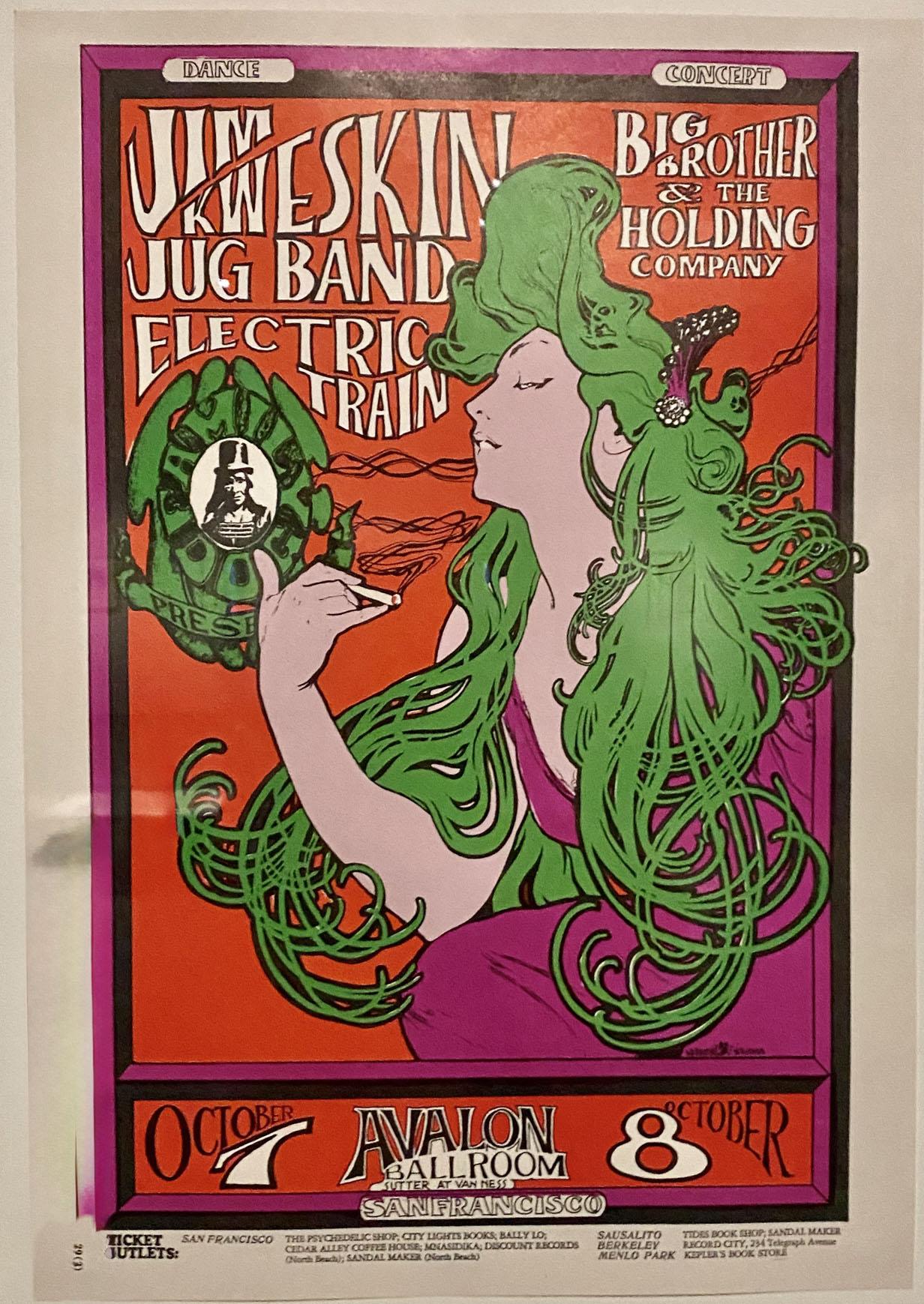
Flowers in your hair? Swirling hair, flowers, and stars were part of Mucha’s “universal language” that took design in a new direction in the 1900s. Museum visitors love pouring over the Sixties album covers and posters detail in the exhibition, remembering which albums they owned and acts they saw, delightedly pointing out the Mucha design influences to their friends.

1966 tour poster for Jefferson Airplane at the Fillmore Auditorium by Stanley Mouse and Alton Kelley.
1971 Skull and Roses tour poster for Grateful Dead by Alton Kelley.

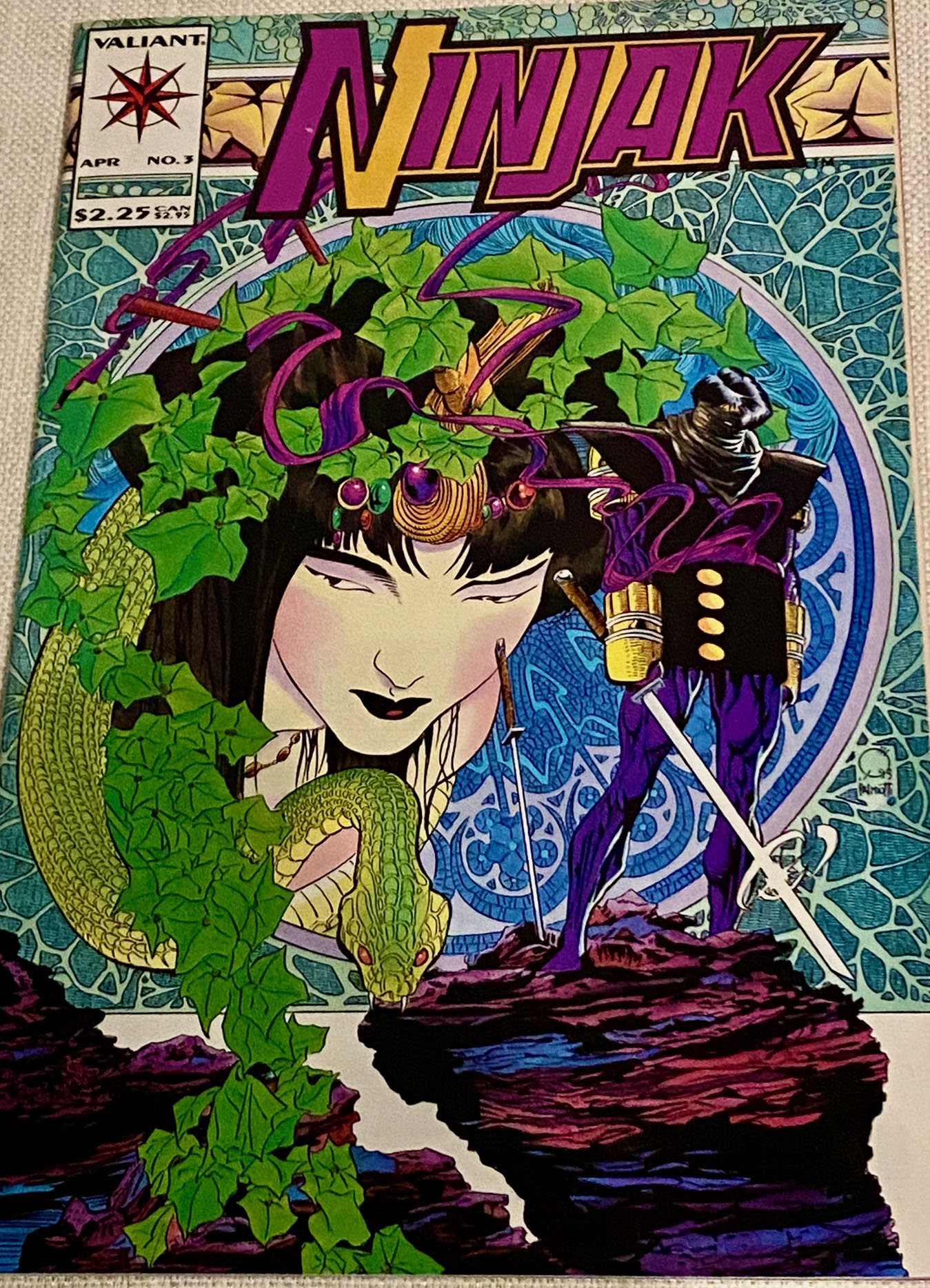
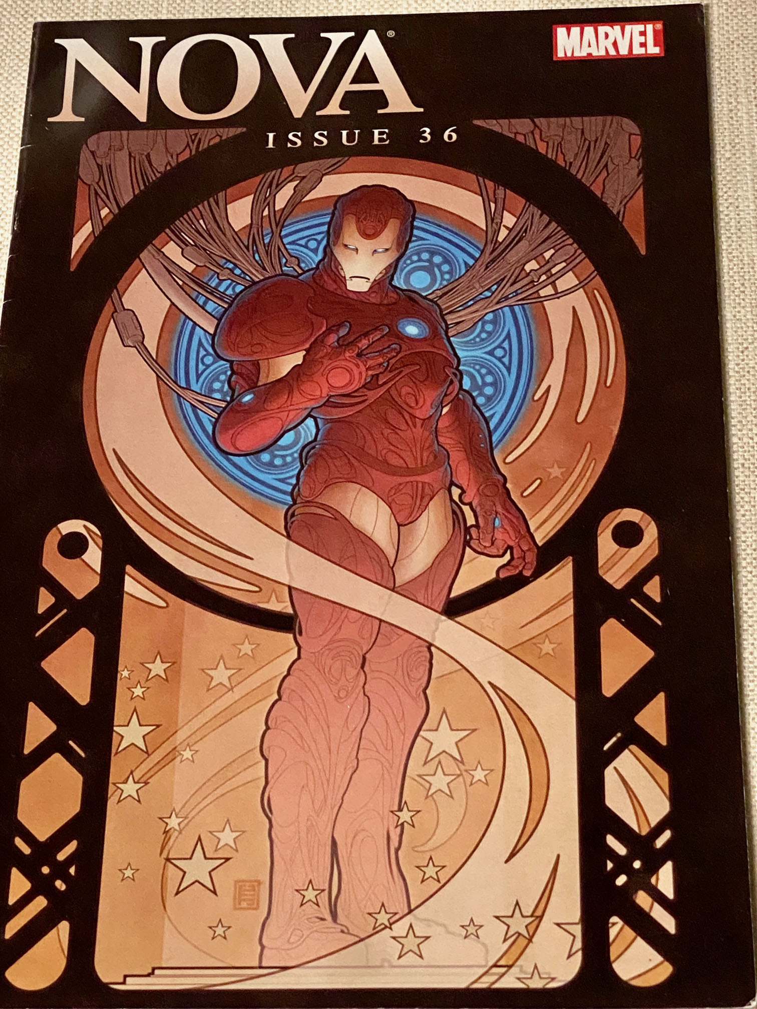
But subsequent generations of media makers also adapted Mucha style – comic book and manga artists.

Joe Quesada’s 1994 Spread, Ninjak cover for Valient Comics.
John Tyler Christopher’s 2007 cover for Marvel’s Nova, no. 36B.

Listen to curator Sato about how Japanes artists adapted Muca’s design breakthroughs for 21st manga fans:

Next on the tour for this beautiful exhibition – the Nelson-Atkins Museum of Art in Kansas City, Missouri (April 11-August 30, 2026) and Museo Kaluz in Mexico City (October 8, 2026 – February 7, 2027).  

The riches on display in this exhibition are also a reminder that much more is on view at the Mucha Museum – a spectacular new venue in Prague opened by the Mucha Foundation at the Savarin Palace in 2025, right on the western edge of Old Town. 

A star framed by a halo: years of Mucha’s poster ads for Sarah Bernhardt’s 1894-1899 plays – Hamlet, Lorenzaccio, and Gismonda. Courtesy: Mucha Foundation.

Jasper Johns Takes Victory Lap at The Whitney

Iconic imagery, big statements, technical mastery, and long-distance endurance are all on display from the second you enter Jasper Johns: Mind/Mirror at The Whitney – the mind-bending retrospective of one of the century’s most celebrated artists.

Then you realize that this 12-part extravaganza is only half the story ­– a mirror image of the Whitney retrospective that is also on display 90 minutes south at the Philadelphia Museum of Art.

1961 Map by Jasper Johns. Courtesy: MoMA
1982 Savarin monotype of Johns’ 1960 bronze.

Each has different works and minutely different themes (the number paintings vs. the flag), but reflect the same scale and scope of the artist’s astonishing 70-year career.

Most art lovers know that the early work of Johns and Rauschenberg in the late 1950s and early 1960s helped to redirect the New York art scene from Abstract Expressionism toward Pop. But show puts a much-needed spotlight on the rest of Johns’ career – how he kept experimenting with media, pushing his own boundaries, manipulating paint to evoke an emotional response, and not letting any art-world “ism” impede his creative journey over the next 50 years.

Hear what the show’s two curators, Scott Rothkopf (NYC) and Carlos Basualdo (Philly), have to say about Johns, the “rules” he “broke,” and the mark his work left upon 20th century American art:

The sheer magnitude and quality of the artist’s output is on full display as you take the journey through the Whitney – masterful paintings, prints, drawings, watercolors, and sculptures

See some of our favorite works in our Flickr album.

Exhibition entrance with full scope of Johns prints.

As soon as the elevator doors open at The Whitney, viewers are confronted with a curved wall that contains dozens of surprises – a chronology of prints stretching from Johns’ early days in New York through works completed as recently as 2019.  Walking left to right, the wall serves as a mini-retrospective as well as the intro to the larger show.  Bravo to the team for this brilliant, engaging welcome.

It’s joyful to poke through the first few galleries and experience Johns’ early experimentations with stenciled lettering, disappearing letters, collaged newsprint, and maps enlivened by painterly gestures and swipes.

But then you see works done in South Carolina, where Johns took in the beach and sky and recollected back to his childhood in the South. Big, bold, mystical, evocative puzzles taking the form of large-scale canvases, small intimate sculptures, and all forms of drawing and mark making.

1964 Studio with paint cans, created at the South Carolina beach.
1967 Harlem Light from Johns’ 1968 Leo Castelli gallery show. Courtesy: Seattle Art Museum.

You experience a room where the team has brought together work originally shown by Leo Castelli in his New York townhouse gallery in 1968. The exhibition designers mimic the size of the original gallery to let you experience the same thrill of interacting with these big, colorful, slightly conceptual, architectural paintings.

The centerpiece of the Whitney exhibition is a spectacular gallery created by the exhibition team to showcase the retrospective’s theme – how Johns used doubles and “mirroring” to explore perception and entice viewers to ponder the works more carefully.  The exhibition designer explains and shows how the famed bronze Ballantine ale cans are the fulcrum around which Johns’ subsequent work revolves:

There are hundreds of loans from other museums and private collectors, and the two museums even swapped some of their own holdings.

And Johns himself has loaned never-before-exhibited works, including watercolors and drawings that he did in the 1980s. Although the colors draw you in, they represent the artist’s process of working through the ravages of HIV and loss inside the art community.

The curatorial precision of the show allows you to experience an evolving appreciation of Johns’ later work – experimental monotypes in the print studio, contemplation of the arc of life in monumental elegiac grey paintings, and sculptures completed in the 2000s. See more on the Whitney website about the works in the show.

1990 watercolor from Johns’ collection with mysterious, surreal, personal imagery.

The latter are displayed in natural light, which allows you to enjoy the cast bronze and aluminum number blocks as the sun shines over the Hudson from different angles. The changes illuminate the hand work, gestures, and conceptual rigor over time – a fitting encapsulation of this two-city tribute to Mr. Johns.

Reverse side of 2008 bronze 0-9 sculpture. Private collection.