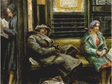
The installation view of T. J. Wilcox: In the Air, 2013. Photo: Bill Orcutt
If you want to enjoy a beautiful view of Manhattan from the roof, don’t worry about the snow, rain, or cold weather. Go over to the Whitney Museum before February 9 and take in the film installation T.J. Wilcox, In the Air, that features a beautiful panorama (from the roof of Wilcox’s Union Square studio) that dreamily introduces six stories about the past and present of life, art, energy, fame, events, and cosmic forces that ebb and flow continuously below.
The big, in-the-round screen circles around you (duck and just walk into it), so you can really take in the view, all the way from the Battery to beyond the Empire State Building.
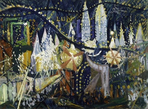
Still from T.J. Wilcox’s panoramic 2013 silent film installation, In the Air. Image courtesy of the artist and Metro Pictures.
The film cycles from dawn to dusk, but along the way, Mr. Wilcox takes you on little journeys as you enjoy his movie panorama. The experience is one where you begin to see New York through his eyes, past and present together.
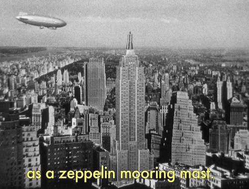
After a few minutes, one of his panorama screens fades you see a short, reflective, poetic, subtitled NYC story-movie. It’s a quiet experience — bringing you back to the Thirties when the Empire State Building was contemplated to be used as a zeppelin-docking station, to the present when 14th Street is one of the best vantage points to contemplate the out-of-this-world spectacle of Manhattanhenge, and the days of glitter, glamour, and grit of Warhol, Gloria Vanderbilt, and fashion-industry icon, Antonio Lopez.

Watching Wilcox’s Gloria Vanderbilt vignette from outside the installation. Photo: Bill Orcutt.
He reminds you that Gertrude Whitney, the museum’s founder, long ago succeeded in a custody battle to care for little Gloria. The film takes you to her apartment and reflects on the fact that Gloria was “in the public eye from birth” and celebrates her vibrant artistic, business, and family accomplishments (re: plenty of shots of Anderson Cooper). Another mini-film focuses upon a nano-second in Warhol’s life, when his Factory crew unfurled Mylar balloons to welcome the arrival of the pope-mobile to New York City in 1965.

Weegee’s Variant of Untitled (Striking Beauty) is hung in an adjacent gallery. Courtesy: Whitney Museum
In his musing on the film about fashion-illustrator extraordinaire, Antonio, Wilcox reveals his surprise that Antonio’s studio was located right next to his own building, takes pleasure in asking us to gaze out over the community where so much magnificent art was made, careers enlivened, and life lived.
In a tiny back-room gallery, the Whitney has installed a few other reflections on skies over the City – Weegee’s lightening strike behind the Empire State Building and Yoko’s Sky TV, are two – but the big “wow” here is Mr. Wilcox’s ability to take us on a 35-minute journey in and among the streets and skyline that from his quiet, contemplative perch.
It’s quite a collage of memory, reflection, mythologies, politics, history, and beauty. Click here to see the Whitney’s slide show of the storyboards in Wilcox’s studio, and listen to him talk about it this beautiful work in this YouTube video: