

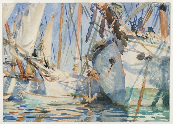
Indian Removal Act Skeuomorph by Sean Paul Gallegos wearing Reserved Ancestry (on right) sculpted from Air Jordans, Arrow collars, and fur.
Get to know some of NYC’s best new artists by strolling through El Museo del Barrio’s La Bienal 2013 on the Upper East Side before January 4.
Full of fun, reality, street life, high-art provocation, and what it’s like to be an artist in 2013, the show has it all – installations, videos, performance-art artifacts, photographs, sculptures and even a tintype. Take a look at some of our favorites on the Flickr feed, and go to the excellent website for El Museo La Bienal 2013: Here is Where We Jump, the seventh edition of this working contemporary artist showcase, which explores both formal-art and ethnic identity issues.

Small detail of Ignazio Gonzalez-Lang’s Guess Who – a grid of 100 inkjet prints of police sketches that appeared in NYC newspapers papers. In this 2012 work, he arranged very similar portraits side by side.
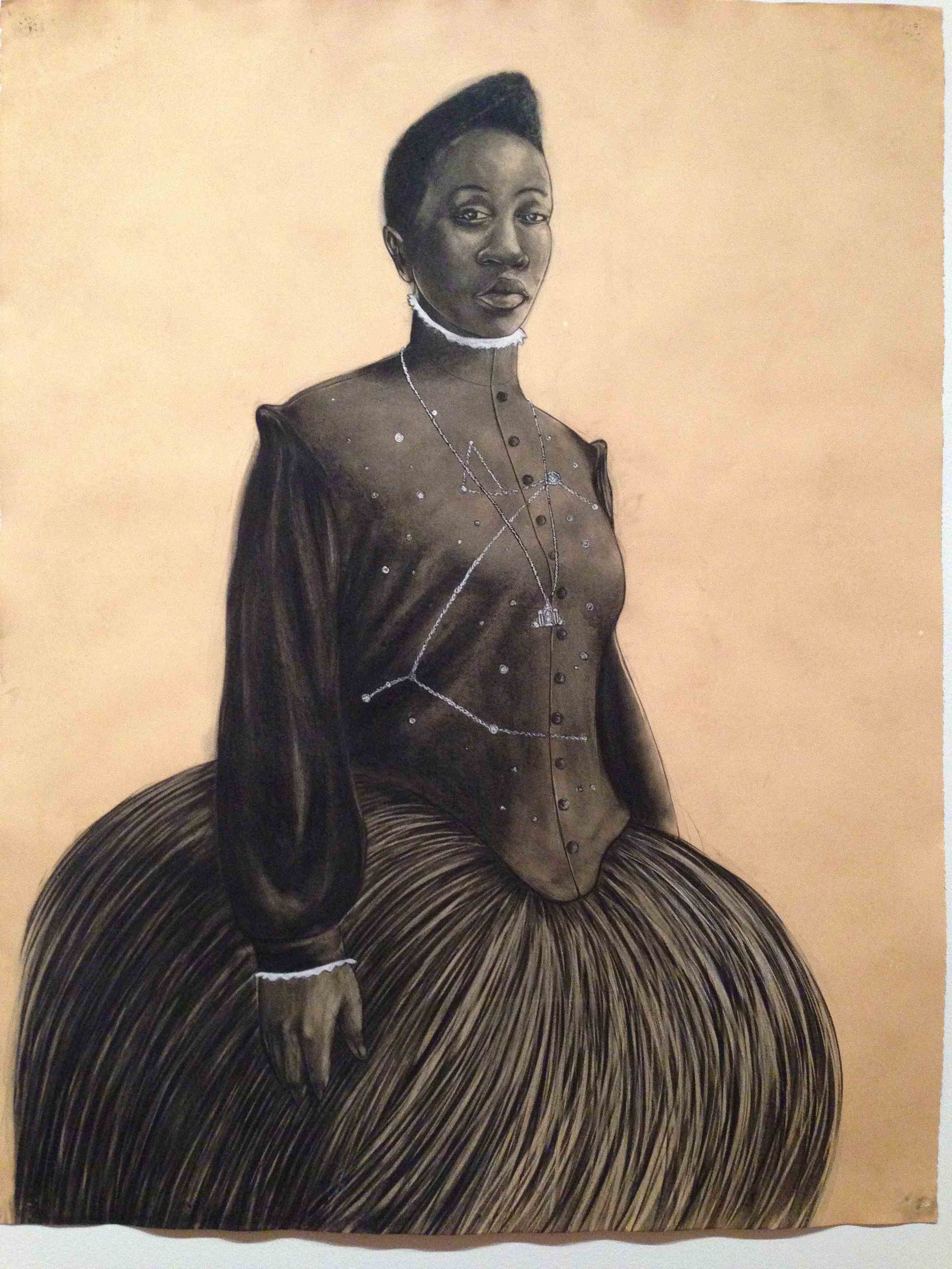
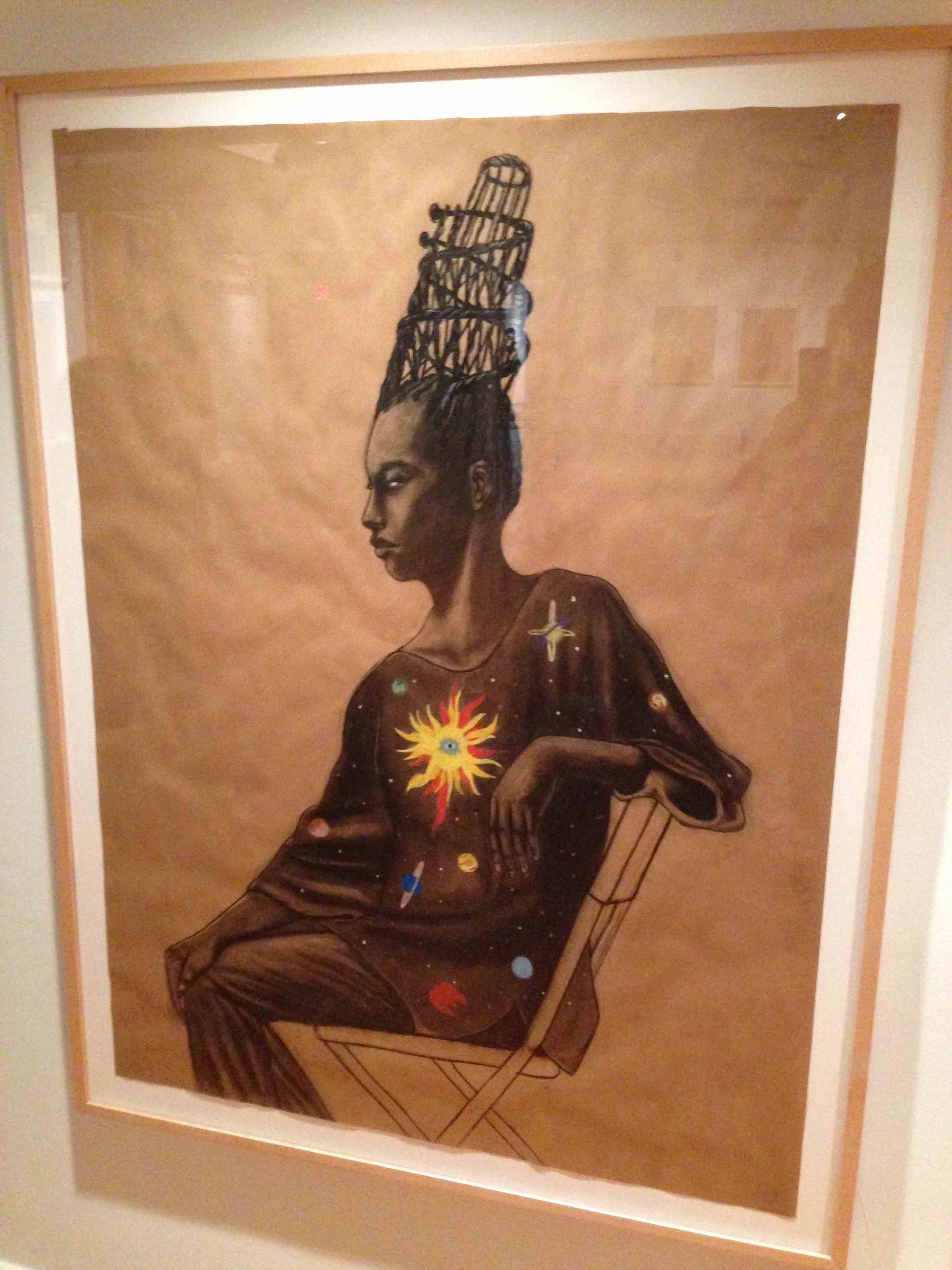
Look closely at the pieces by Sean Paul Gallegos, an artist who considers himself a product of colonial ancestry (his father is Tiwa and Spanish from New Mexico and his mother is Cree and French from Canada). Gallegos juxtaposes his “anthropological” self-portrait with his Native American-inspired headdress made entirely out of cut-up Air Jordan sneakers, Arrow shirt collars, and fur.
A grid of 100 inkjet prints of police sketches by Ignazio Gonzalez-Lang, an NYC Puerto Rican artist, also puts identity to the test. For Guess Who, he’s collected police sketches that have appeared in New York City newspapers, slapped them into a grid, and arranged them in pairs that look all-too-similar. Super thought-provoking.
The Cortez Killer Cutz Radio installation by Eric Ramos Guerrero, a Philippines-born artist, also gets into your head but out of your comfort zone. It’s a full-size, two-room simulation of a Southern California hip hop/R&B radio station streaming late-night song dedications by girlfriends to their incarcerated boyfriends.
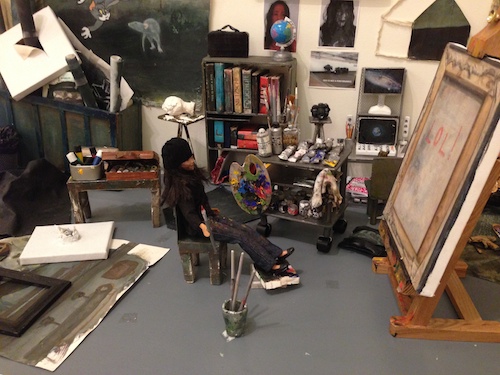
Close-up of the doll-artist contemplating her studio output in Julia San Martin’s Dollhouse
Julia San Martín’s Dollhouse, on the other hand, is a very tiny, detailed installation of a look into the mind and work of the artist. On a miniscule set of her studio, a doll-size painter works on her paintings and drawings, which the Chilean-born artist often rearranges and reshuffles to mimic the working life and consternation of deciding what to paint and what to show.
RISD-trained Gabriela Salazar also looks inward to her studio experience, but in a more formal way. As an artist that often creates large-scale constructed works in the community, she’s taken the remainders of some of her projects – wood shims, foam, cardboard, felt, rope, and wire – and turned them into tiny-scale minimal masterworks, all displayed in a type of “gallery show within a show.”
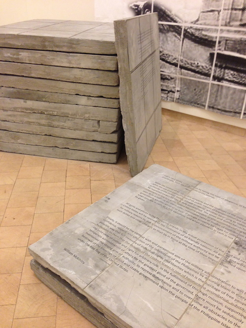
Ramón Miranda Beltrán’s historic documents cast in concrete, featuring President McKinley’s treaties that gave Guam and the Philippines to the US after the Spanish-American War
And be sure to look for Gabriela Scopazzi’s hilarious Amarilla video where she seranades a captivated group of llamas with an aria. (Sorry, it’s for in-person viewing only and not on the web.)
Work through the show’s website to see more of each artist’s work and learn more about what makes them tick.


