
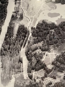
Herwig Sherabon’s 2019 Landscapes of Inequality NYC No. 2, showing median income per block
As the 2020 Census winds down across New York City, it’s nice to be reminded of the history and impact of what’s been revealed since 1790, when census-data gathering began. Who We Are: Visualizing NYC by the Numbers, on view at the Museum of the City of New York through October 18, presents not only rich archival material but an intriguing display of new data-visualizations that were commissioned specifically for this show.
Although the museum shutdown curtailed in-person viewing until a few weeks ago, the curators wisely transported the story and some of the works to an on-line exhibition that explained the history of the decennial census, why it matters to New York, and how new stories are told when artists get their hands on the data.

Tenement House Committee of 1894 map of nationalities inhabiting Lower Manhattan
When we visited in person, it was nice to see historic documents (or facsimiles of them) up close, like the page listing people and occupations (attorneys, stone cutters, boat makers) along Nassau Street in 1812 and the detailed illustrations of the “counting machines” used by men and women tallying the census on the cover of 1890 Scientific American. Take a look at our Flickr album.
But it’s also nice to see data visualizations from past decades, when no one had digital tools at their disposal and everything was drawn pen-and-ink and embellished with watercolor. And to see evidence of Congressional trailblazers, like Shirley Chisholm, getting out into the street to show their constituents the importance of being counted.

Detail of Jill Hubley’s 2019 Race in NYC from neighborhood data
Today’s news is full of stories about whether an undercount is happening in New York, but the MCNY collection shows newspaper after newspaper from the past, where politicians, social-justice advocates, and everyday citizens have voiced the same concerns. It’s useful to see the pie chart of the types of Federal programs whose dollars are apportioned based upon the census.
But the star attractions are the enormously compelling contemporary visualizations displayed in the “Art of Data” gallery. It’s a clean, modern, immersive experience walking among the giant projections of work.
Take a look at three of the works featured in MCNY’s on-line exhibition:
Here is the tree-ring-inspired Simulated Dendrochronology of Immigration to New York City, 1840 – 2017, created in 2019 by Northeast University designers Pedro Cruz, John Wihbey, and Felipe Shibuya. Left and right growth reflects immigration flow to the US from either Asia-Pacific or Europe.
Here, see how artist Neil Freeman uses 2017 American Community Survey data to reconstitute population blocks in New York City according to inequality and injustice in his 2019 video The Grid Series.
The shape of New York’s population blocks make another appearance in artist/developer Jill Hubley’s 2019 visualization Languages of New York.
Read more about each of these works on the MCNY’s site.

Another great article by Susan B. I’m quite partial to maps!
Thanks, Lisa! You and me both!!!
Thanks so much for posting this, Susan!
As one NYC’s brave US Census workers, I really appreciate your comment, Nancy!!!